Lōkahi is a fictional awareness convention focused on urban planning aspects with the help of the American Red Cross in Maui, Hawaii; it is based on a true event, the Lahaina wildfires disaster in 2023. This convention brings the Maui/Lahaina community, Lahaina small business owners, community leaders, and outside entrepreneurs together to rebuild while promoting a better zero-emission environment and emergency strategies to improve and to prepare it for any future natural disasters. This awareness convetion help prevent a tragic disaster like the Lahaina wildfires.
Type: CSUSB Student Collaboration Team Project (Urban Planning Team)
Timeline: August — December 2023
Tools: Procreate, Adobe Illustrator, Adobe Photoshop, Adobe InDesign, Adobe Dimension, Adobe After Effects
Problem
As an urban planning and design team that worked with the American Red Cross, the Maui community needs resources to improve preparedness for natural disasters and better emergency strategies. They can take proactive steps to protect their community while ensuring that cultural identity and environmental sustainability are upheld in the face of natural disasters. By focusing on collaboration and preparation, they can build resilience and foster a vibrant future together.
Solution
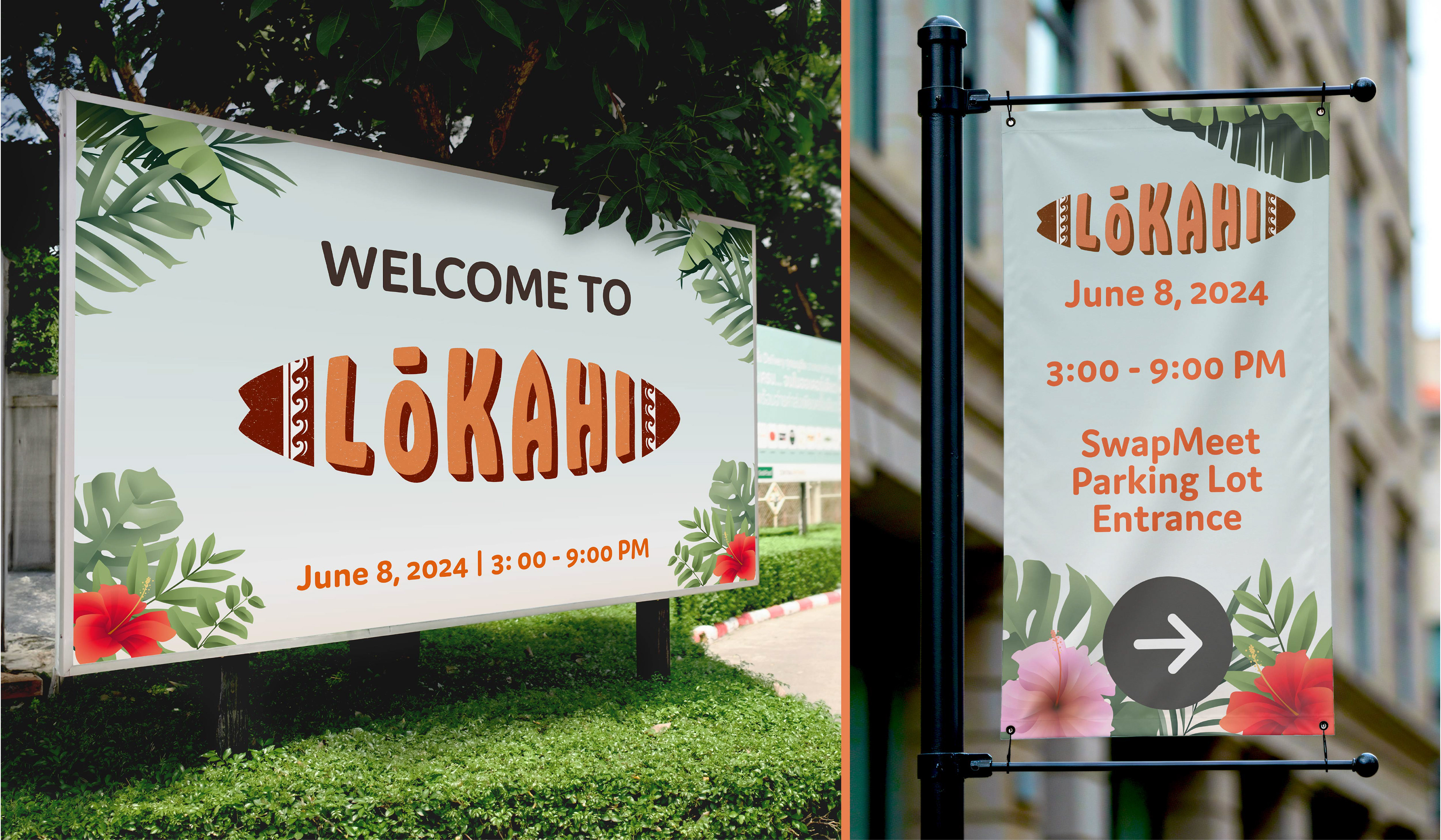
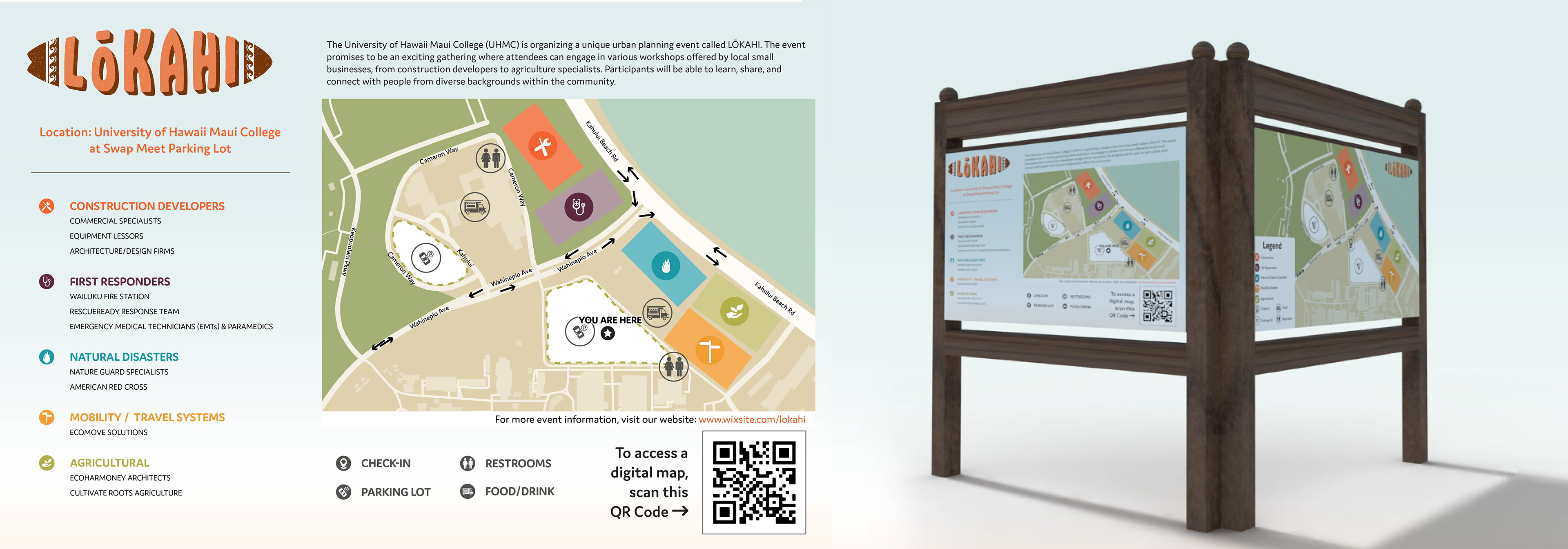
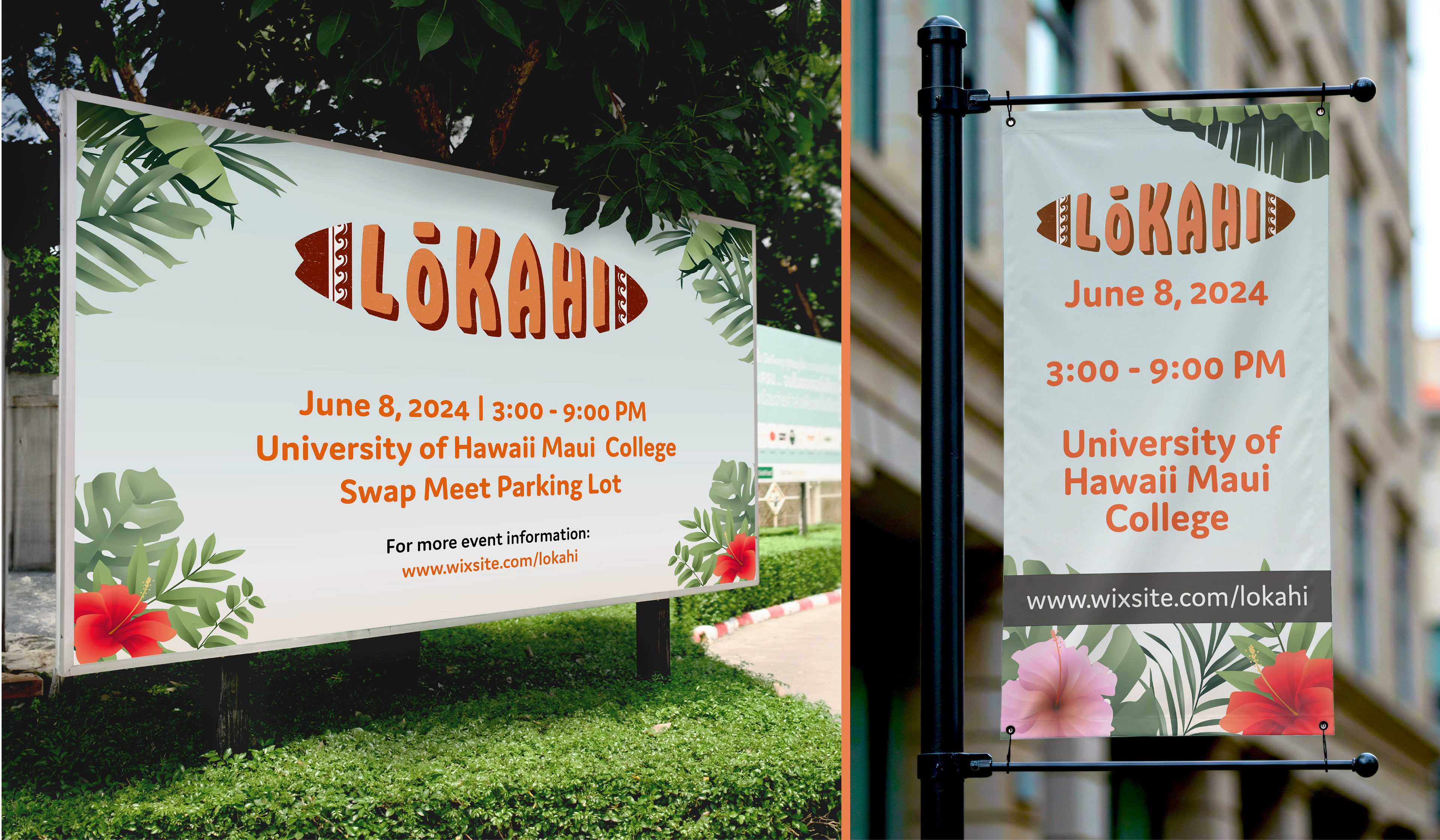
Making a convention looks more friendly and fun by creating a fictitious 1960s beach-party-themed event using a topical and shore-themed look and feel of the event. Our venue take a place at the University of Hawaii Maui College (UHMC). This location is the perfect place to invite all the Lahaina small business owners, community leaders, attendees, and outside entrepreneurs, where they can generate better ideas and offer solutions and resources within the community and tourists for preparation on future natural disaster events.
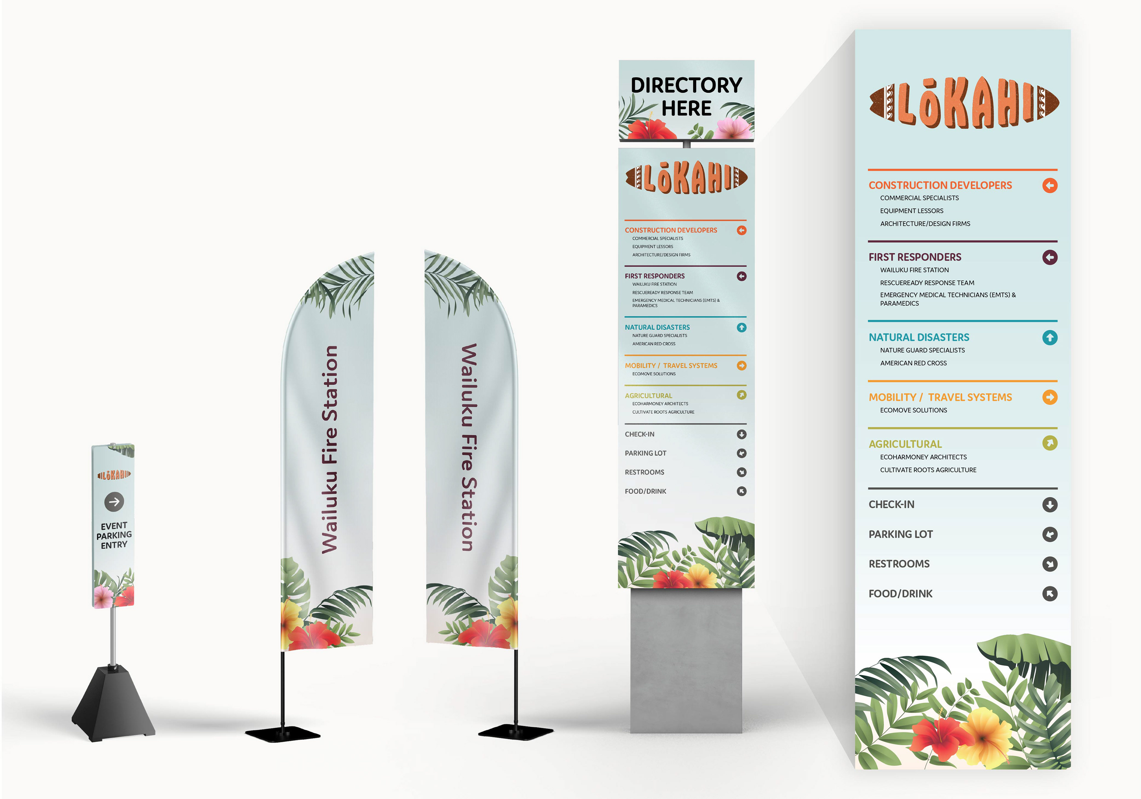
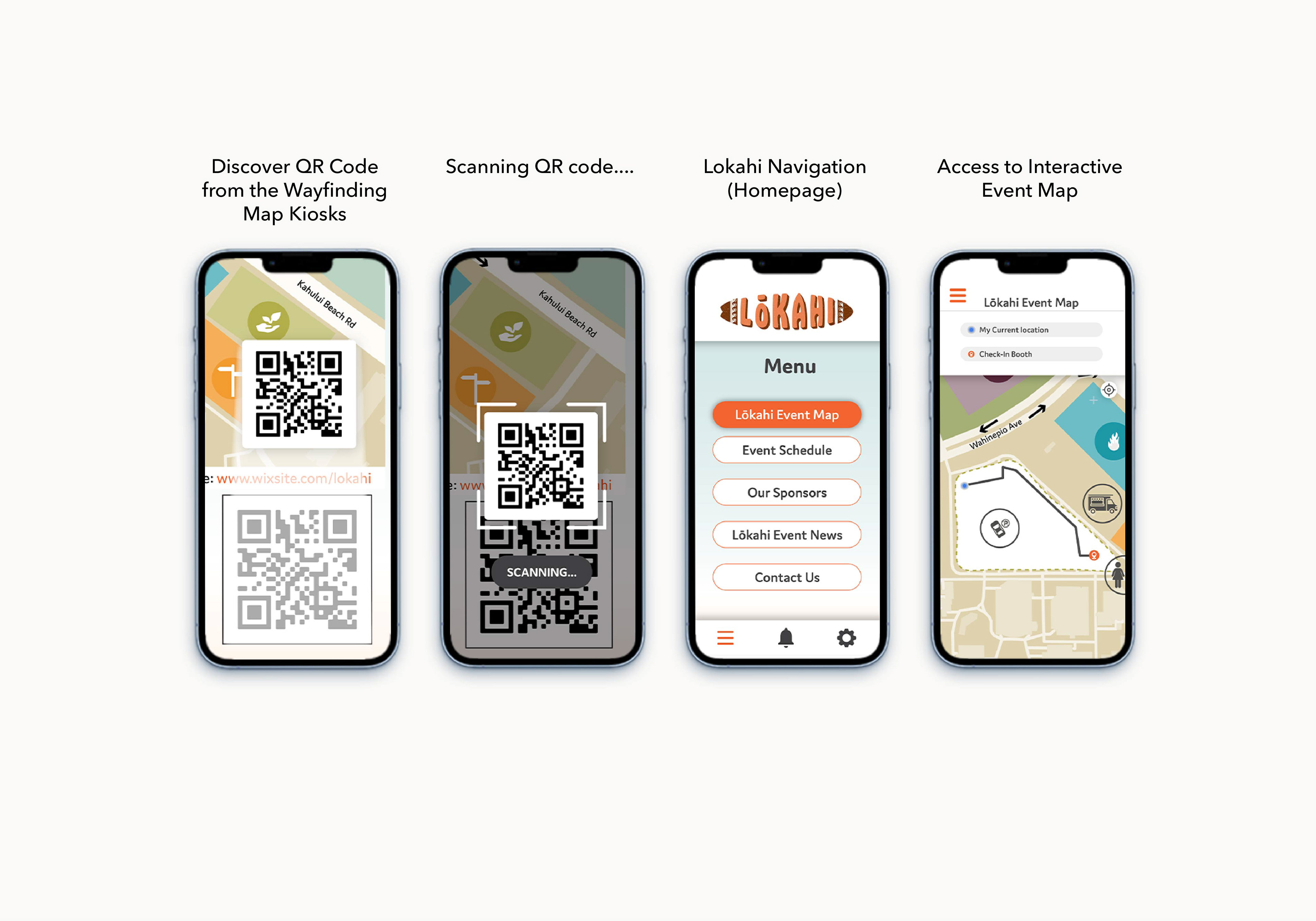
Deliverables are required for the pre-event and during-event phases. I was responsible on my part for urban-planning deliverables for both phases: Logo Design (Static and Animation), Branding Design, Invitation Design, Badge/Lanyard Design, Mobile Apps Design, Wayfinding/Signage Design, and Custom Booth Table Design.
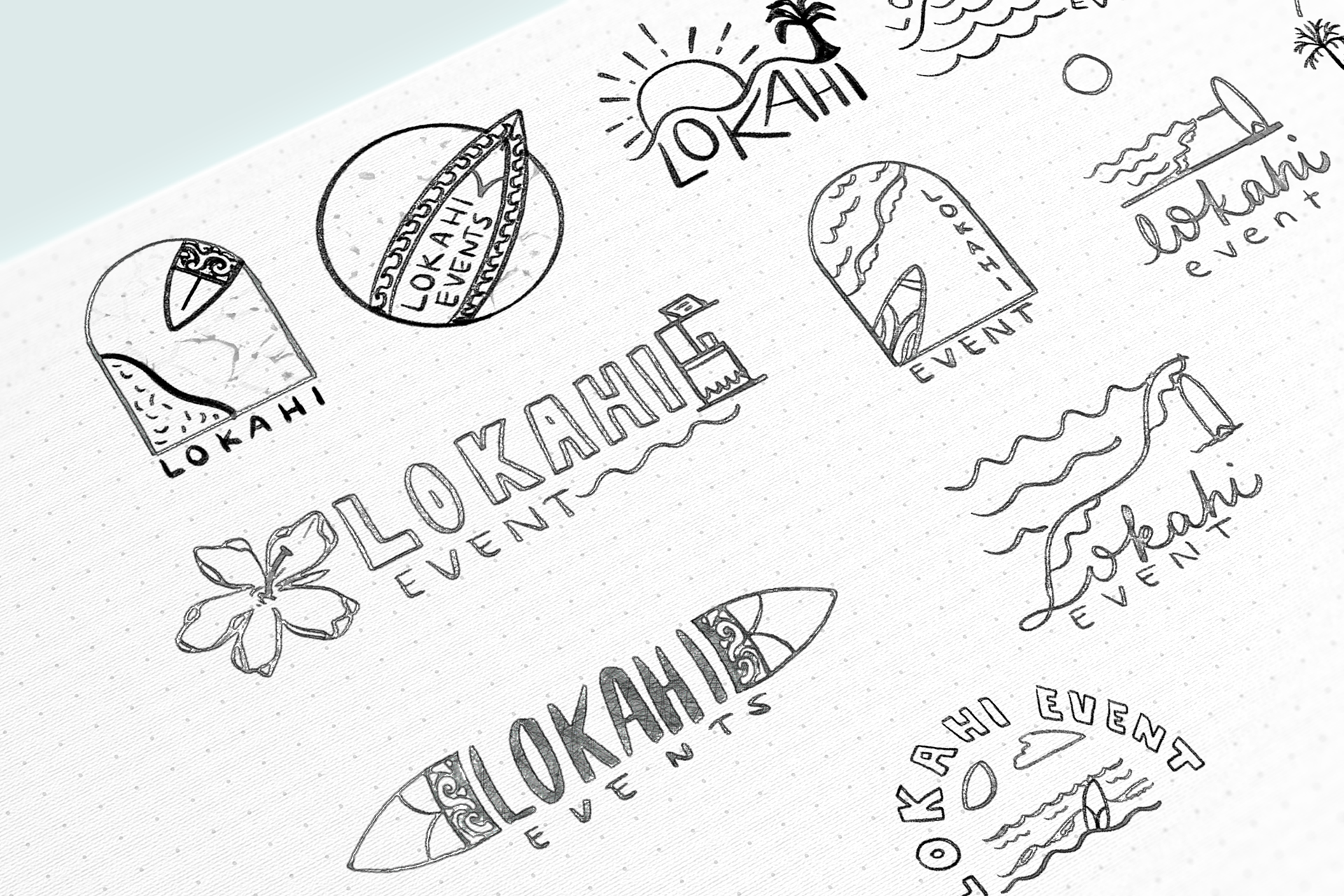
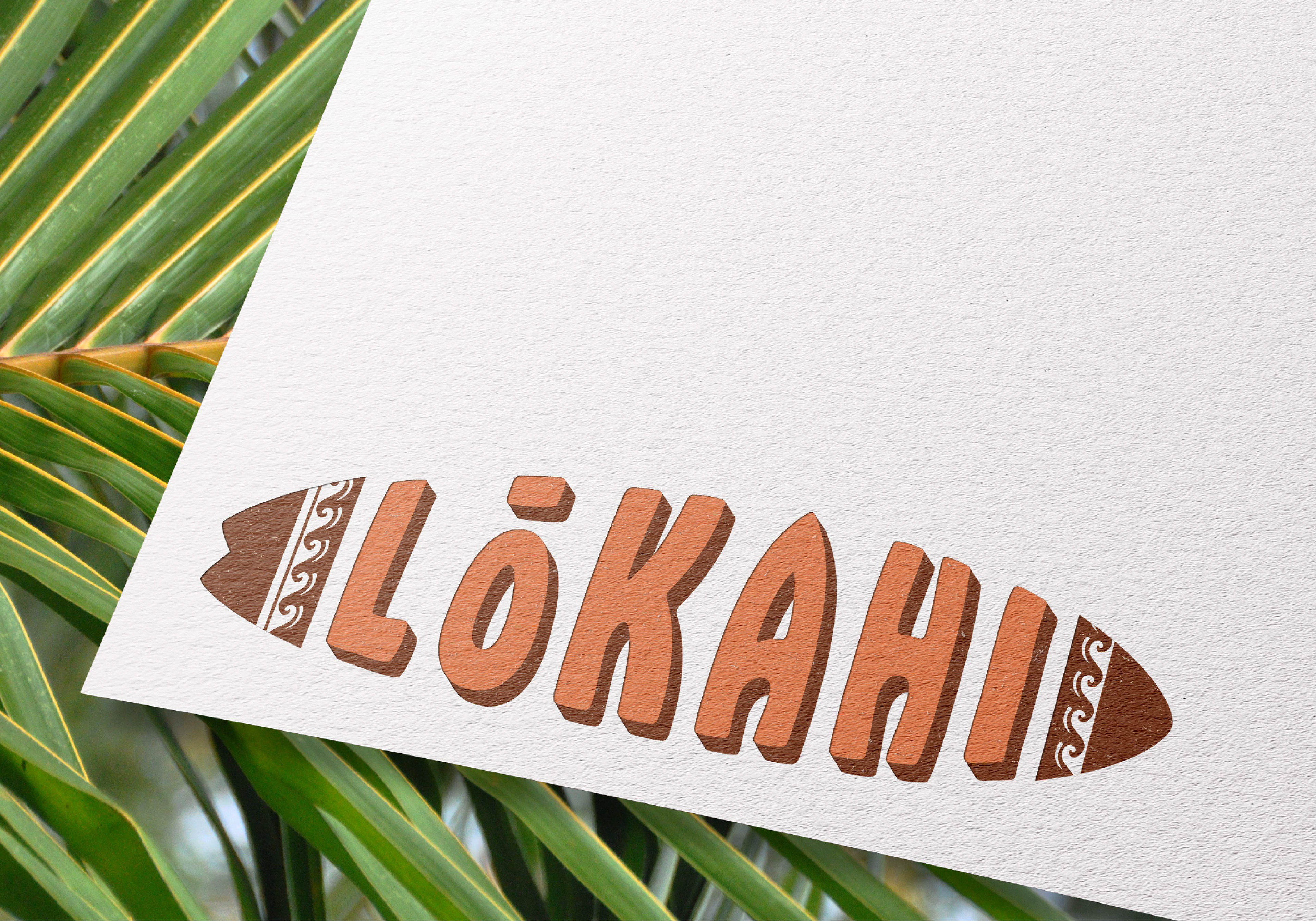
The Strategy (Logo & Branding)
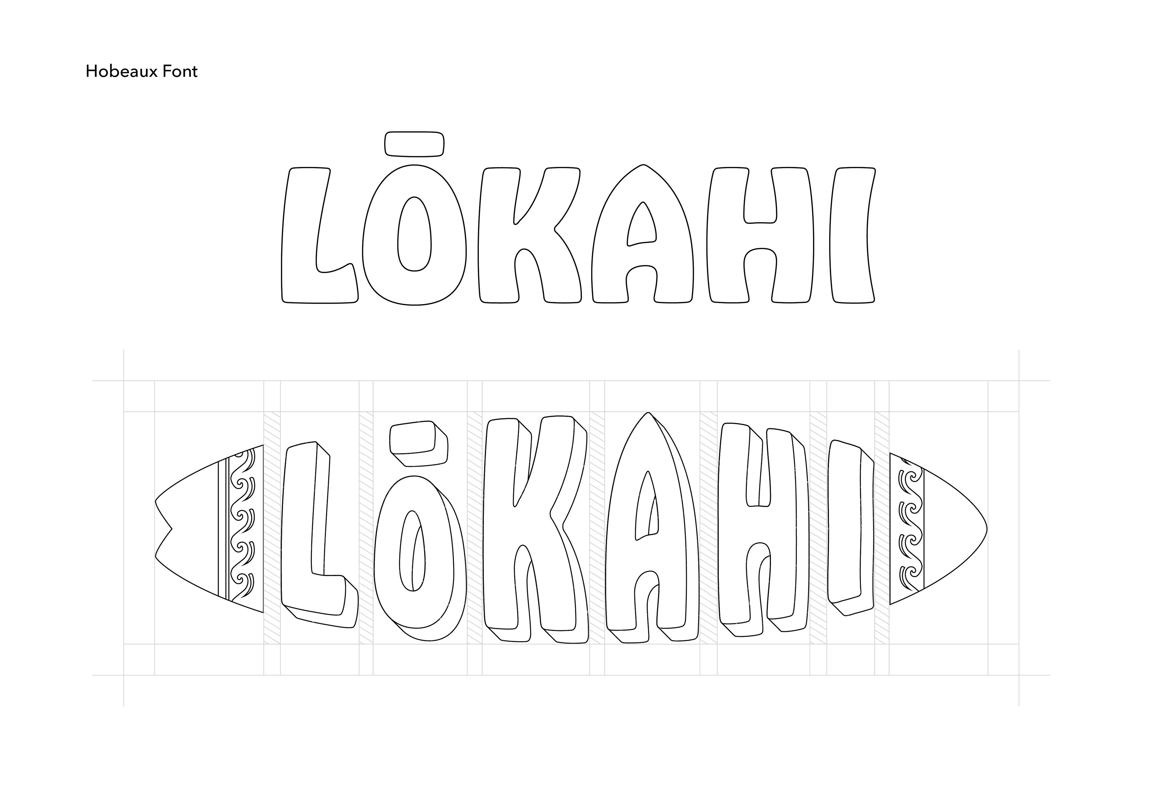
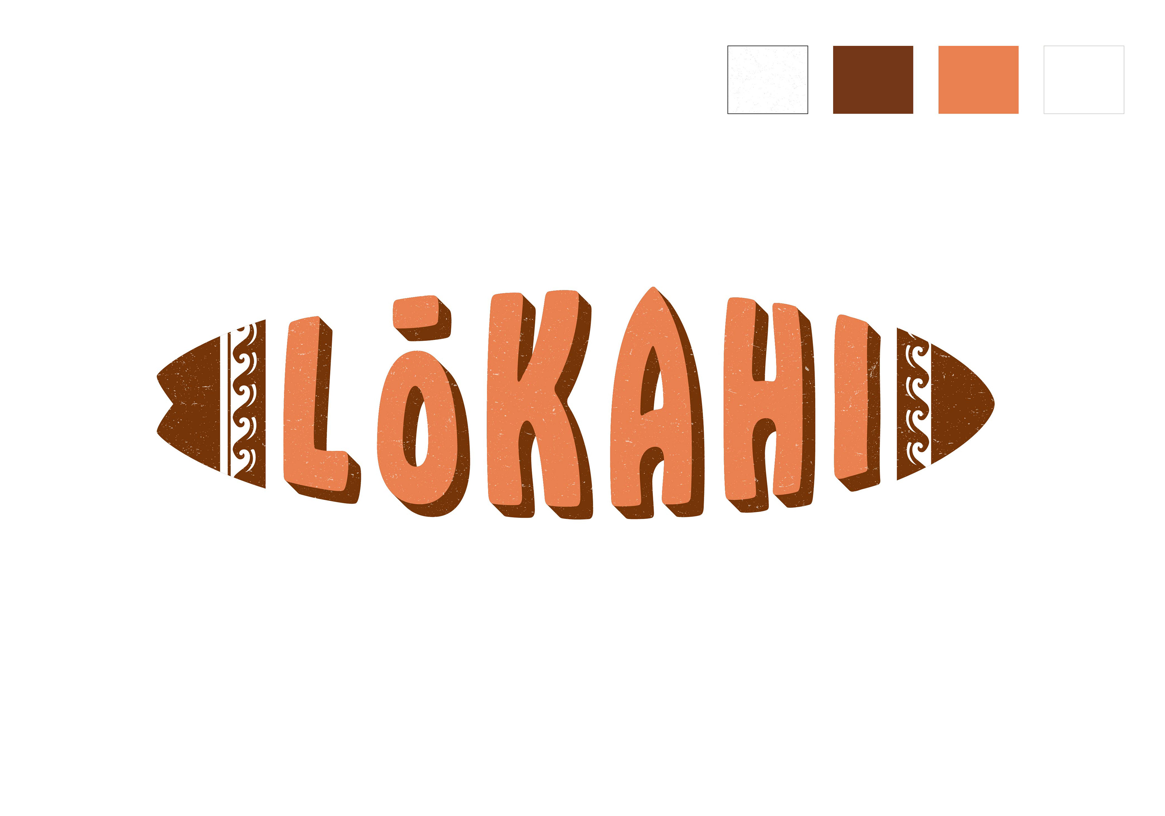
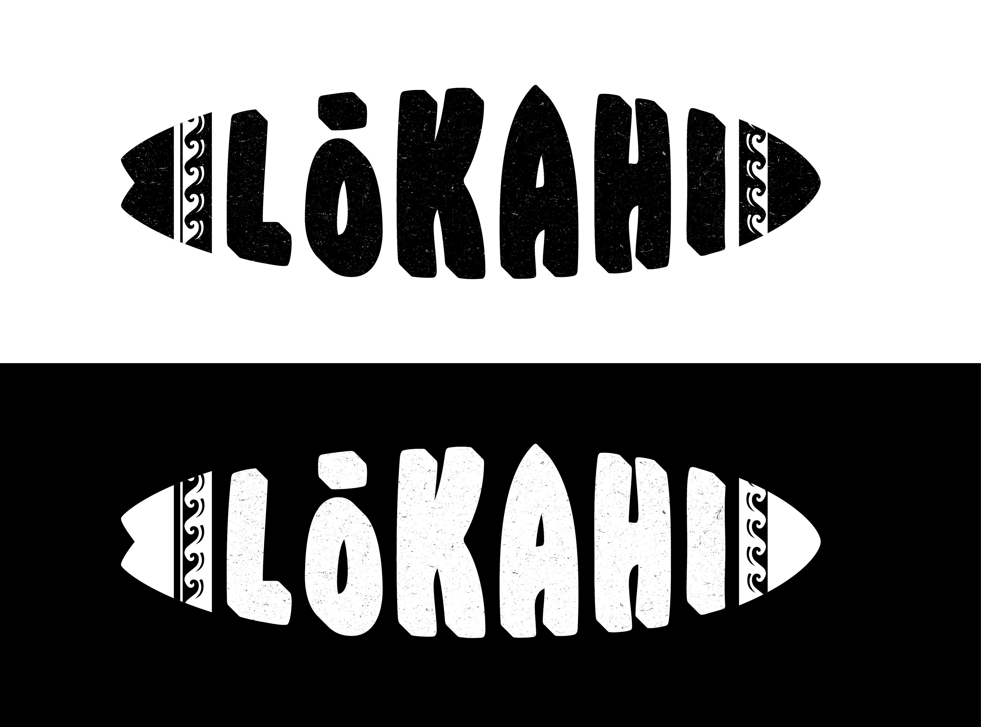
The chosen logo incorporates a surfboard and water wave pattern, representing traditional gatherings that often take place on the surf and being on the shore and under the seawater. The inspiration for the surfboard design comes from the Retro Fish style, which resembles a fish and symbolizes the act of riding it in the water. The noise texture effect creates a vintage 1960s appearance.
As part of the deliverables, an animation video featuring a logo created in After Effects conveys the sense of flowing water.
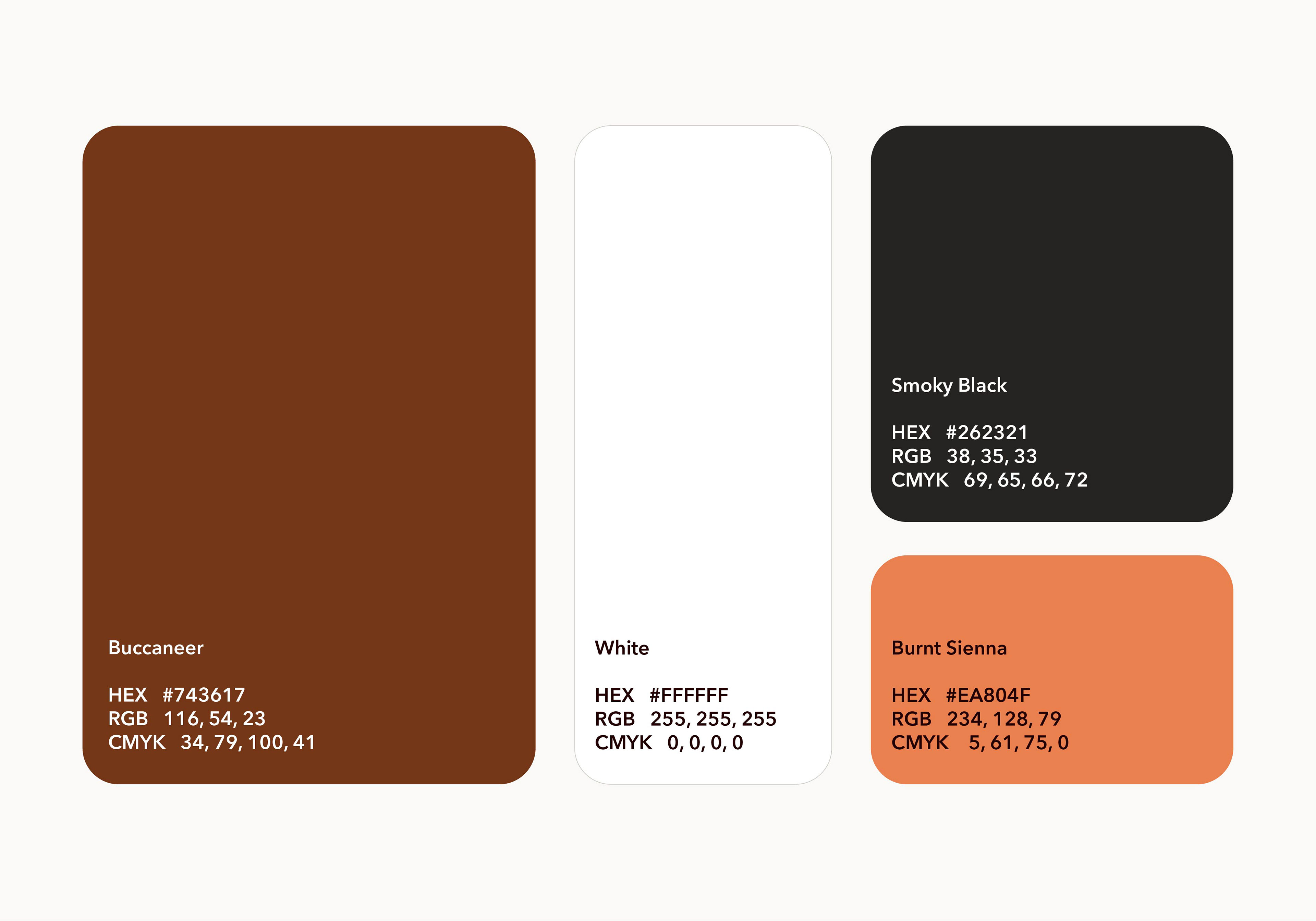
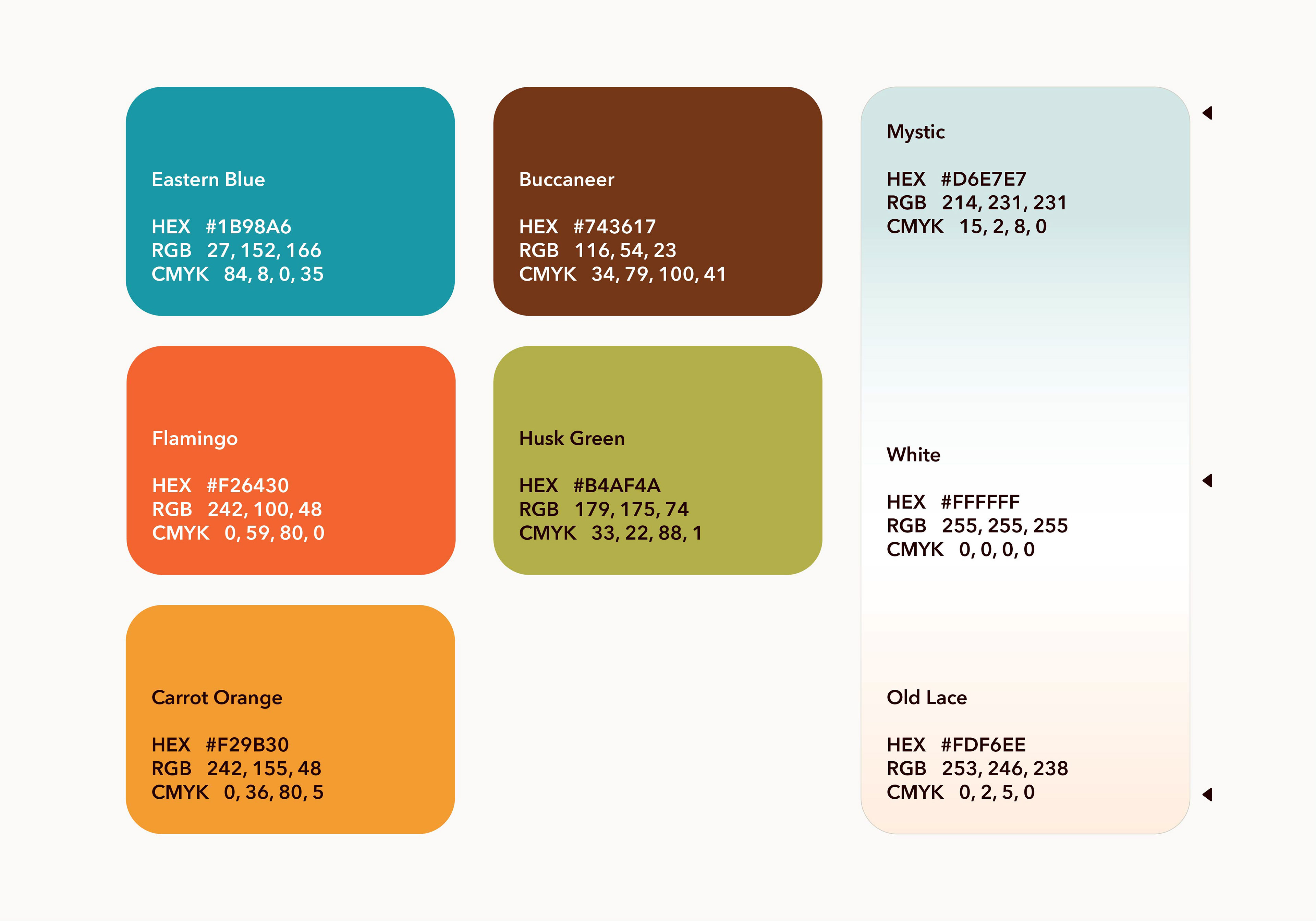
Color Palette
The color selection represents the simple, muted colors for the feel and look of the vintage 1960s. The colors have been seen on printed media from the 1960s era, where they have faded artwork, such as old posters, newspapers, and old magazines.
Typography
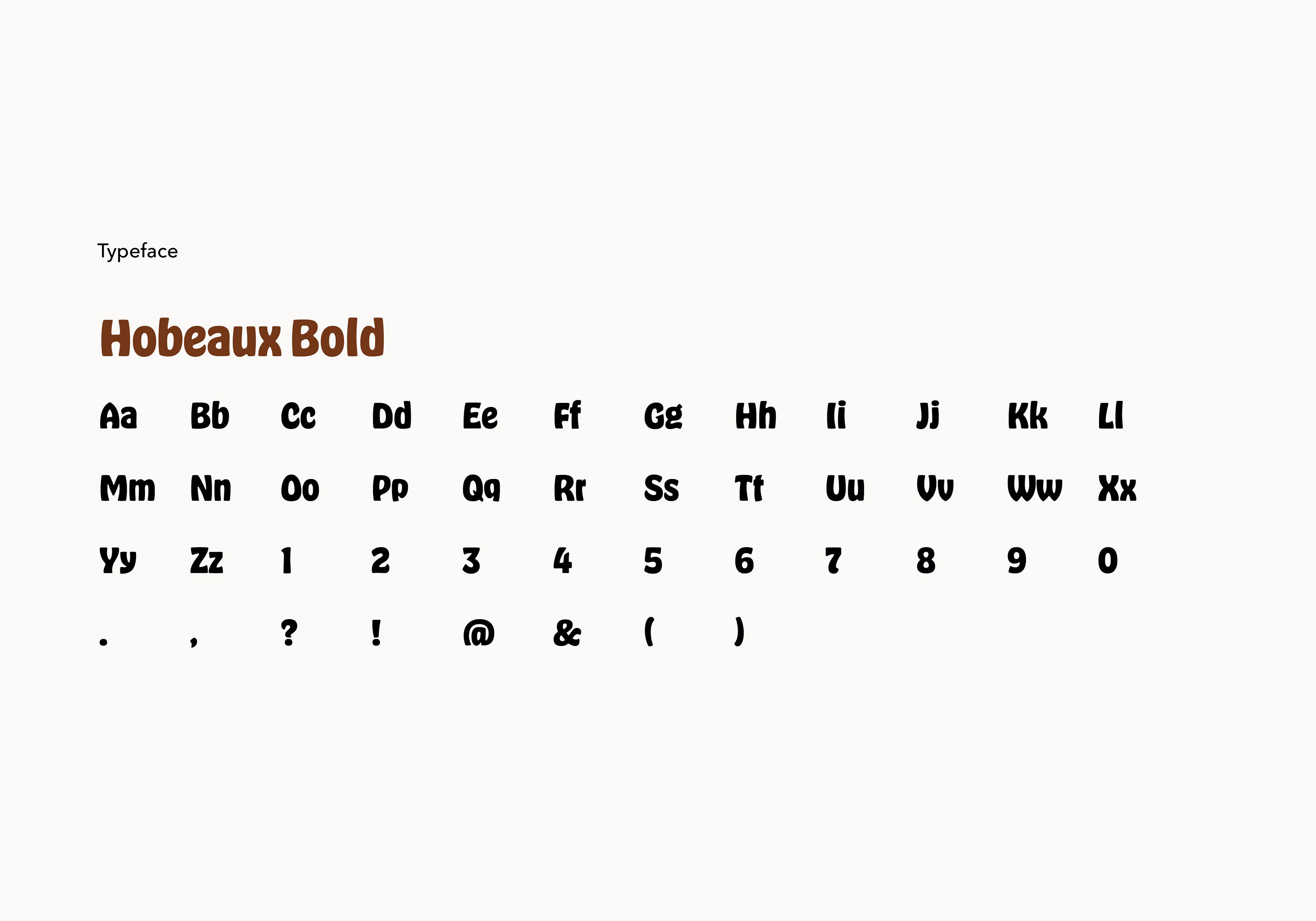
Hobeaux is a sans-serif typeface with stylized, curved letterforms, creating unique, eye-catching designs with a retro touch. Hobo's lack of straight lines and right angles is also a breath of fresh air.
Noise/Grundge Texture
The text and designs possess a grungy texture to make a design that looks like the 1960s. The color scheme includes white, orange, and reddish brown that make it look a calm and welcoming ambiance.
Animation
The animation depicts a water dip from the top of the background to the base of the surfboard as it creates a filling water and animates a waving motion horizontally that floods up upward to the top of the logo until the logo is filled up completely.
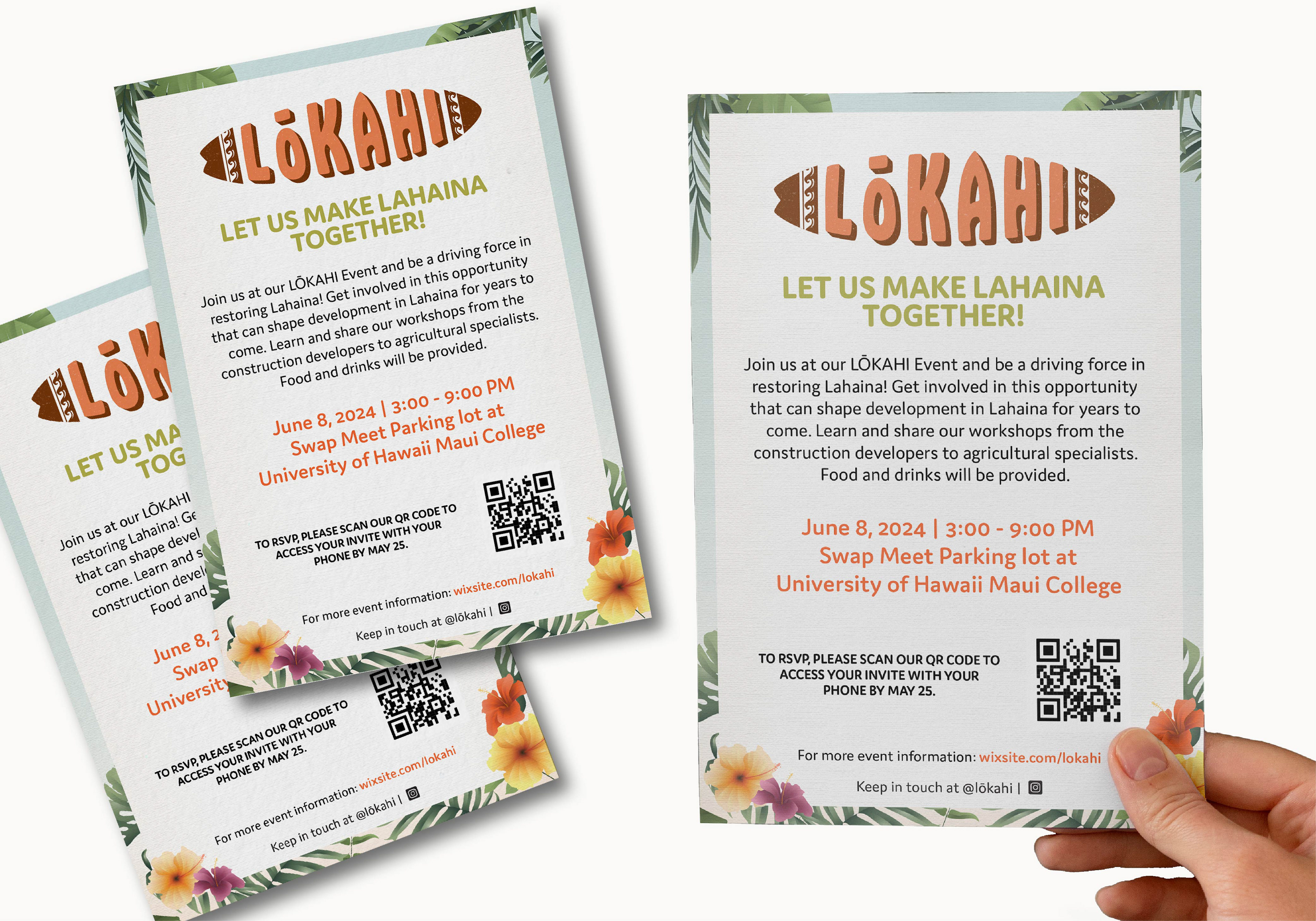
Urban Planning Event and Its Strategy
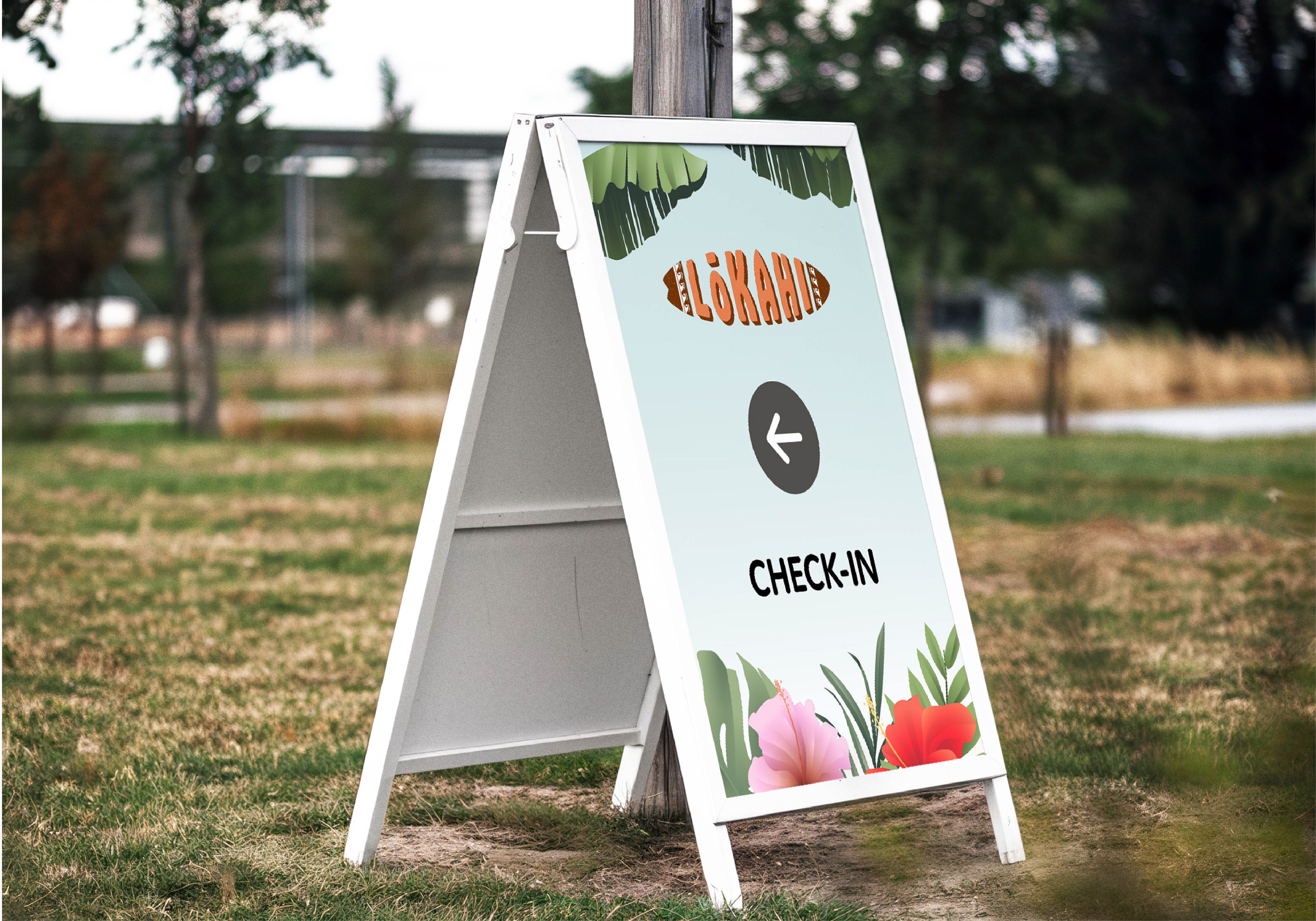
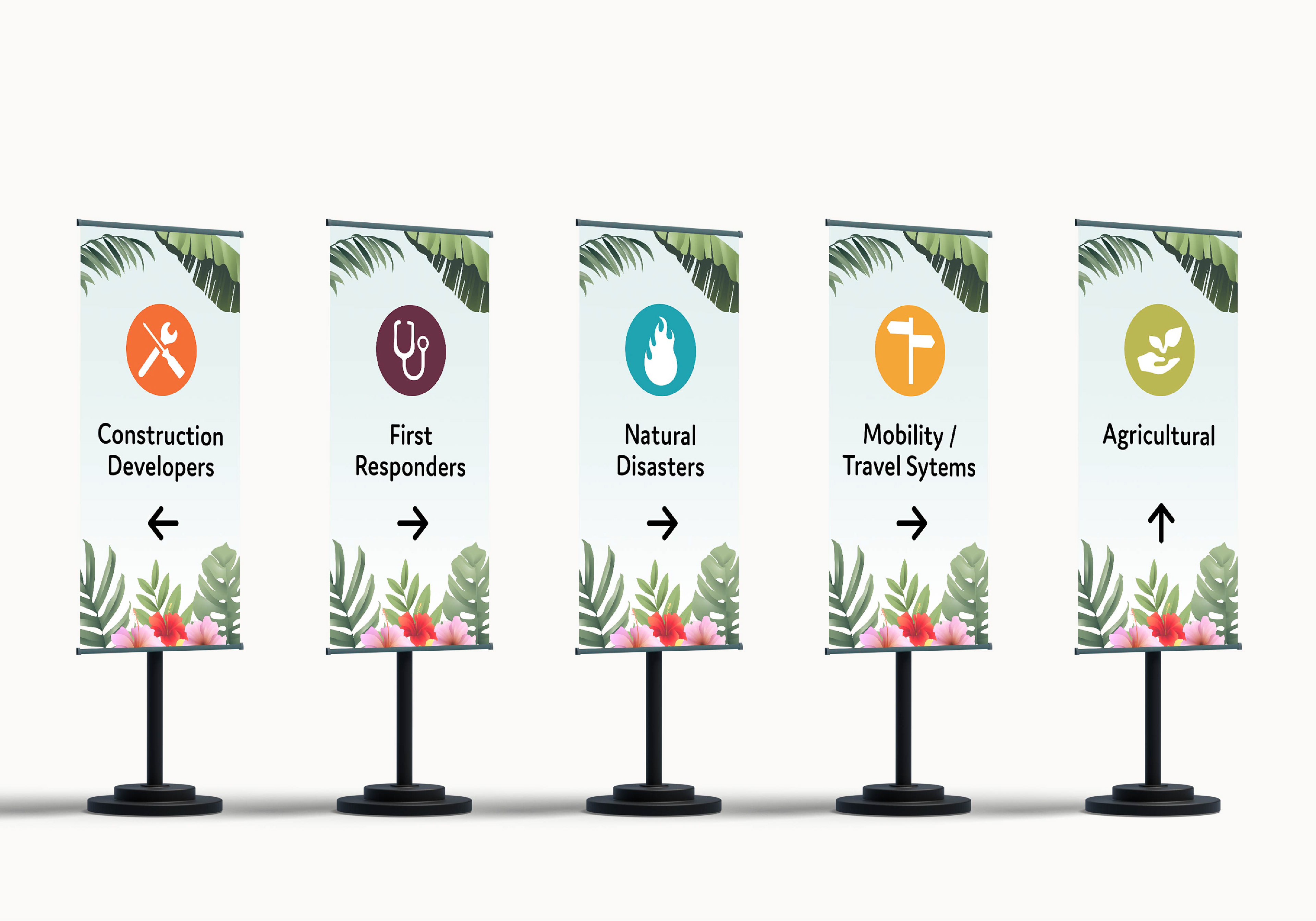
The event theme is a retro 1960s beach party incorporating Hawaiian colors, tropical and Hawaiian flowers to create the look and feel of the event. The event system design showcases how the signage, wayfinding, and other deliverables will look in person at the convention. Another component included in this system is the custom outdoor booth, which will be situated at the event's entrance. This project involved two distinct phases of the design process, encompassing the entire event from start to finish.
Color Palette
Using a washout color scheme and gradient background that aligns with Hawaii culture and traditions of both Lokahi and the Maui/Lahaina community. These colors represent elements from the beach, such as water, sand, flowers, sun, and joy.
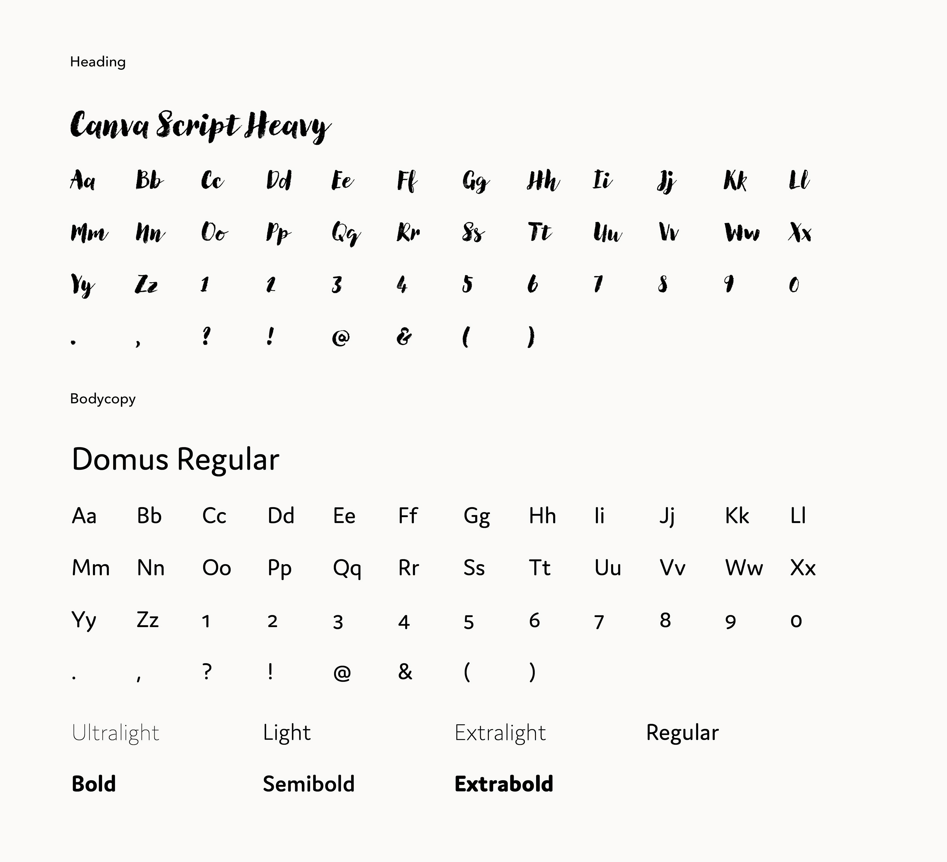
Typography
The decorative style headlines use the Canvas Script font, while the body text uses the Domus family font for better readability.
Pre-Event Design and Brand in Action
My tasks for the pre-event phase design: event invitation, signage, and mobile application.
During-Event Design and Brand in Action
My tasks for the during-event phase design: map, signages, wayfinding graphics, lanyards, and entrance booth