Project Type:
Sparc Cooperative Product
Scope of Work:
Concept Development
Creative Direction
Branding Identity
Logo Design
My Role:
Lead Graphic Designer
Tool:
Adobe Illustrator
Creative Team:
Sparc Cooperative Team
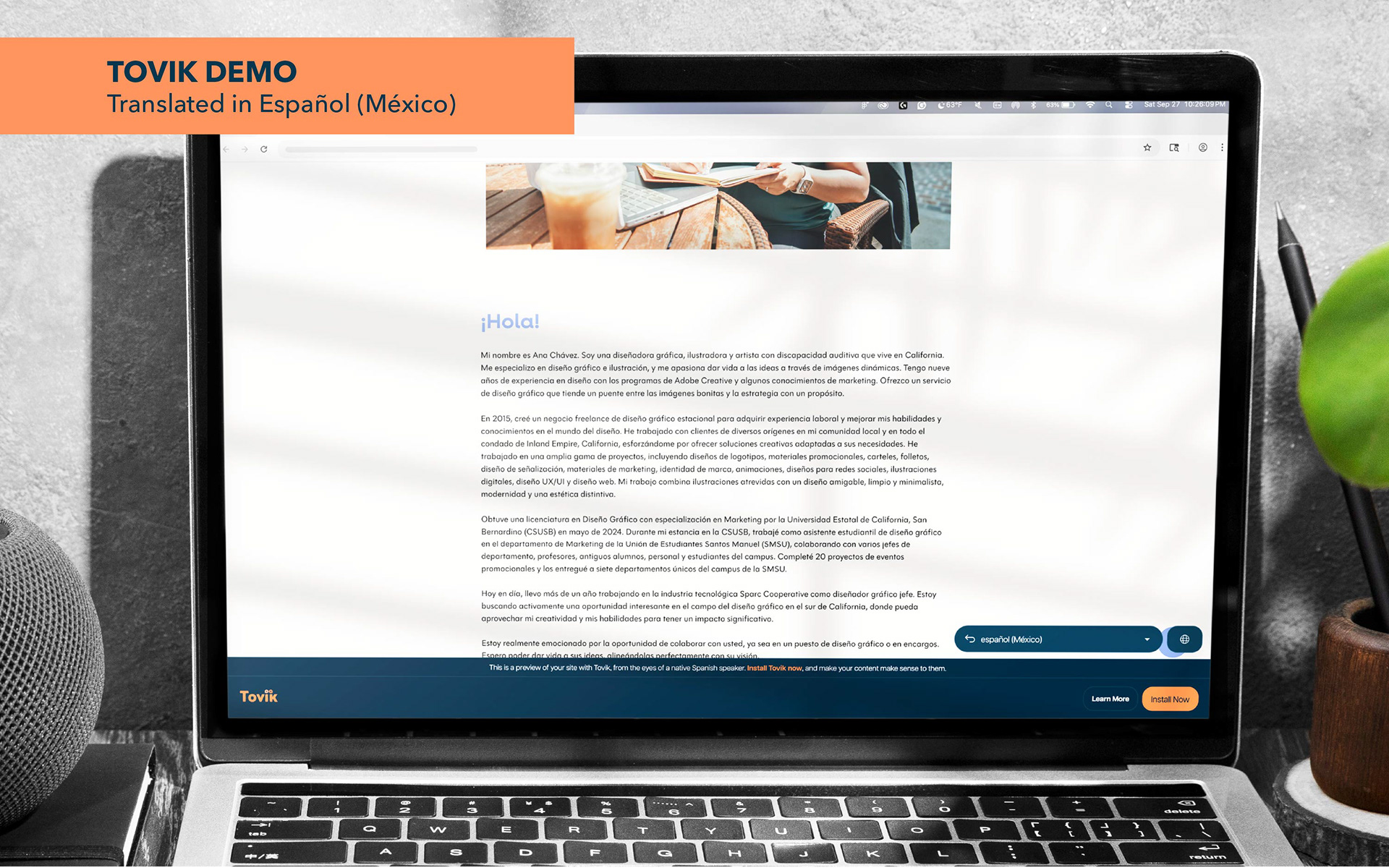
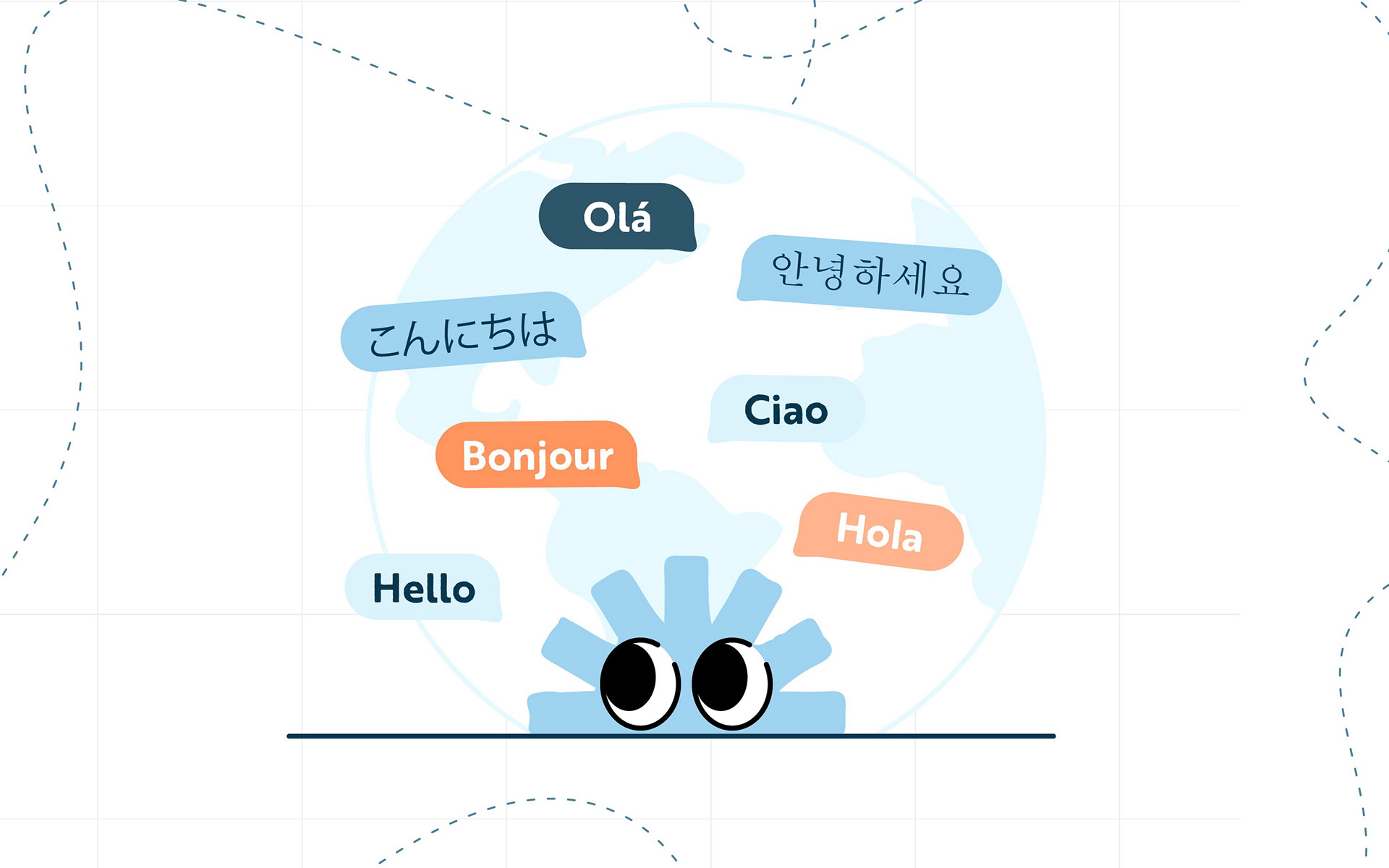
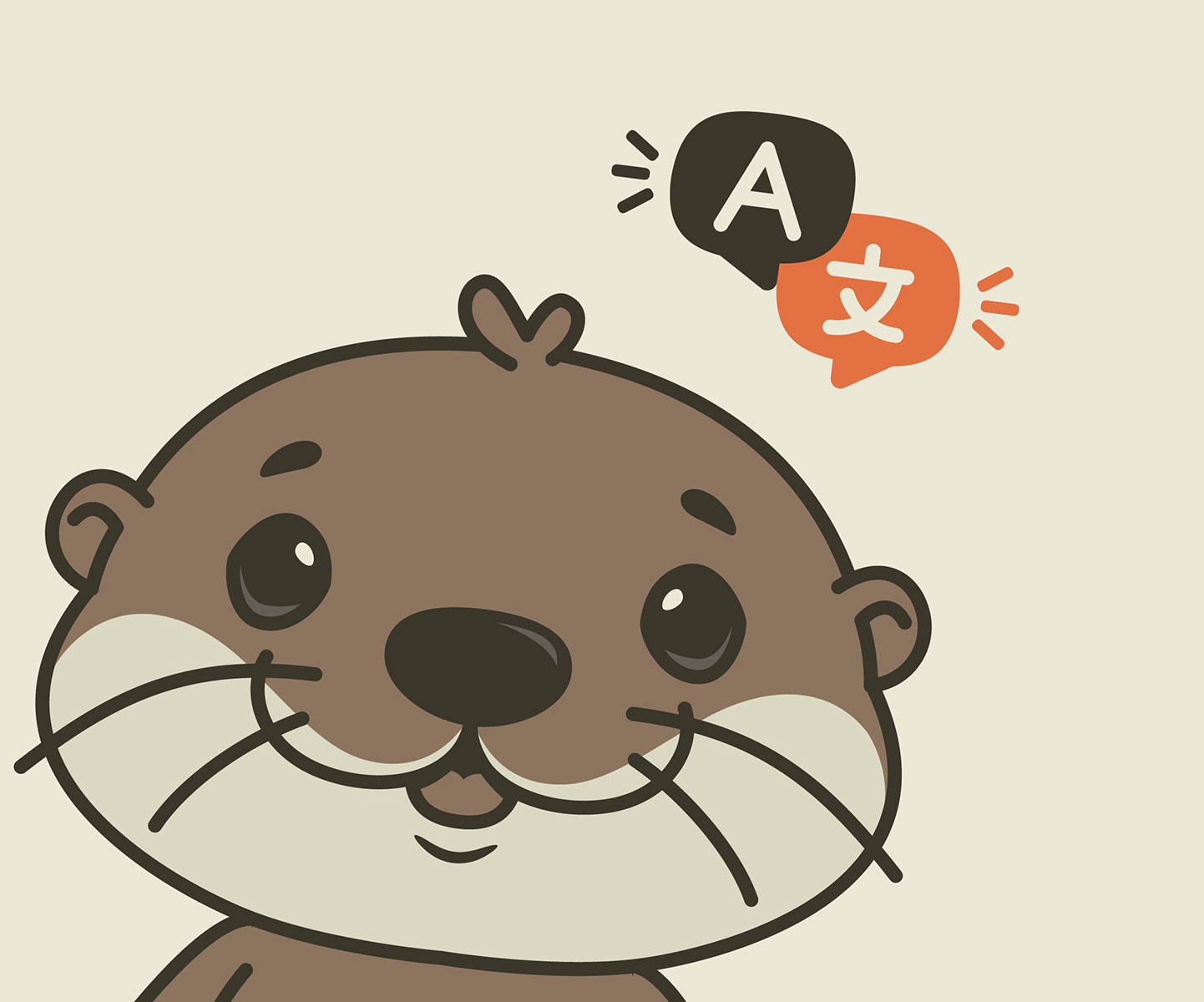
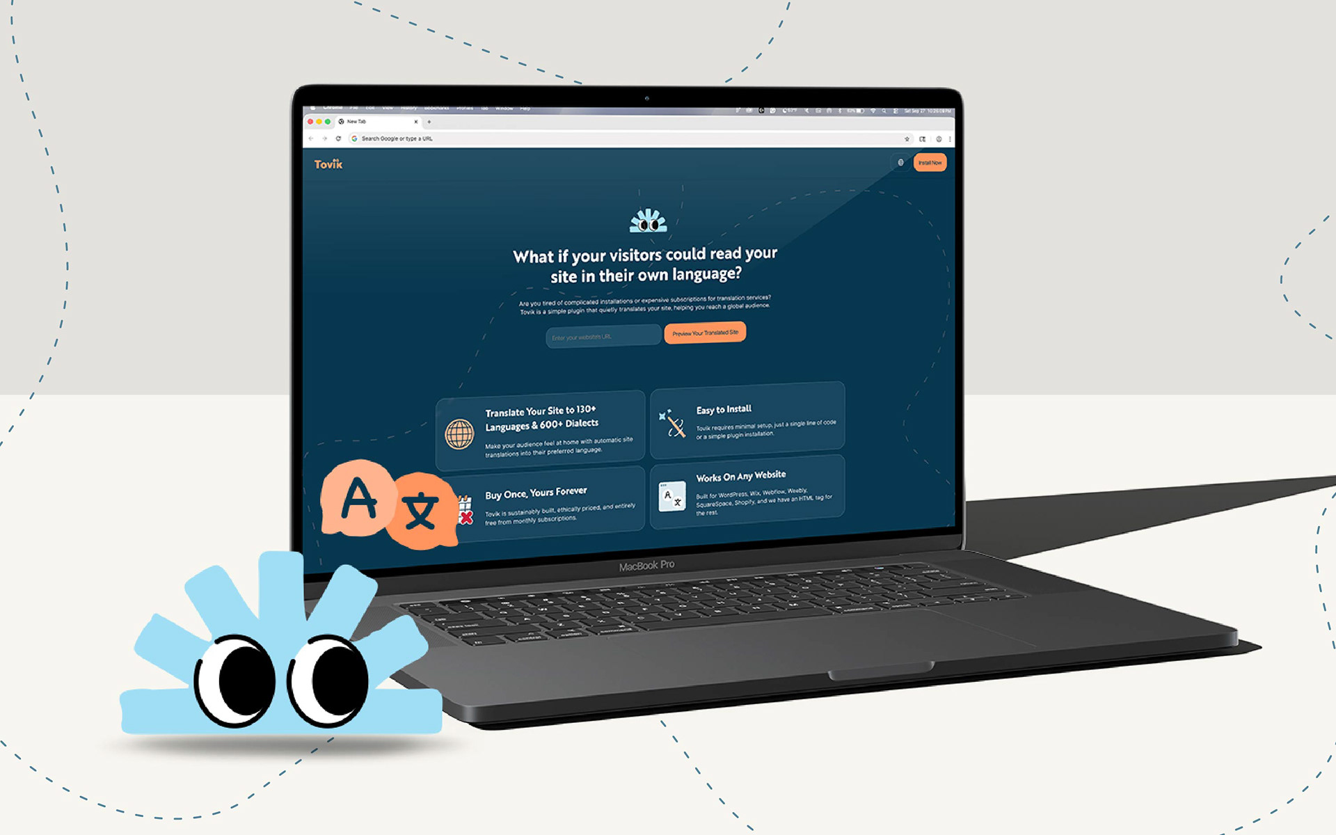
Tovik ( Tovik.app ) is a multilingual online translation tool designed to be an affordable solution for small business owners, startup founders, and non-profit organizations with growing teams to reach their audiences worldwide.
My Approach
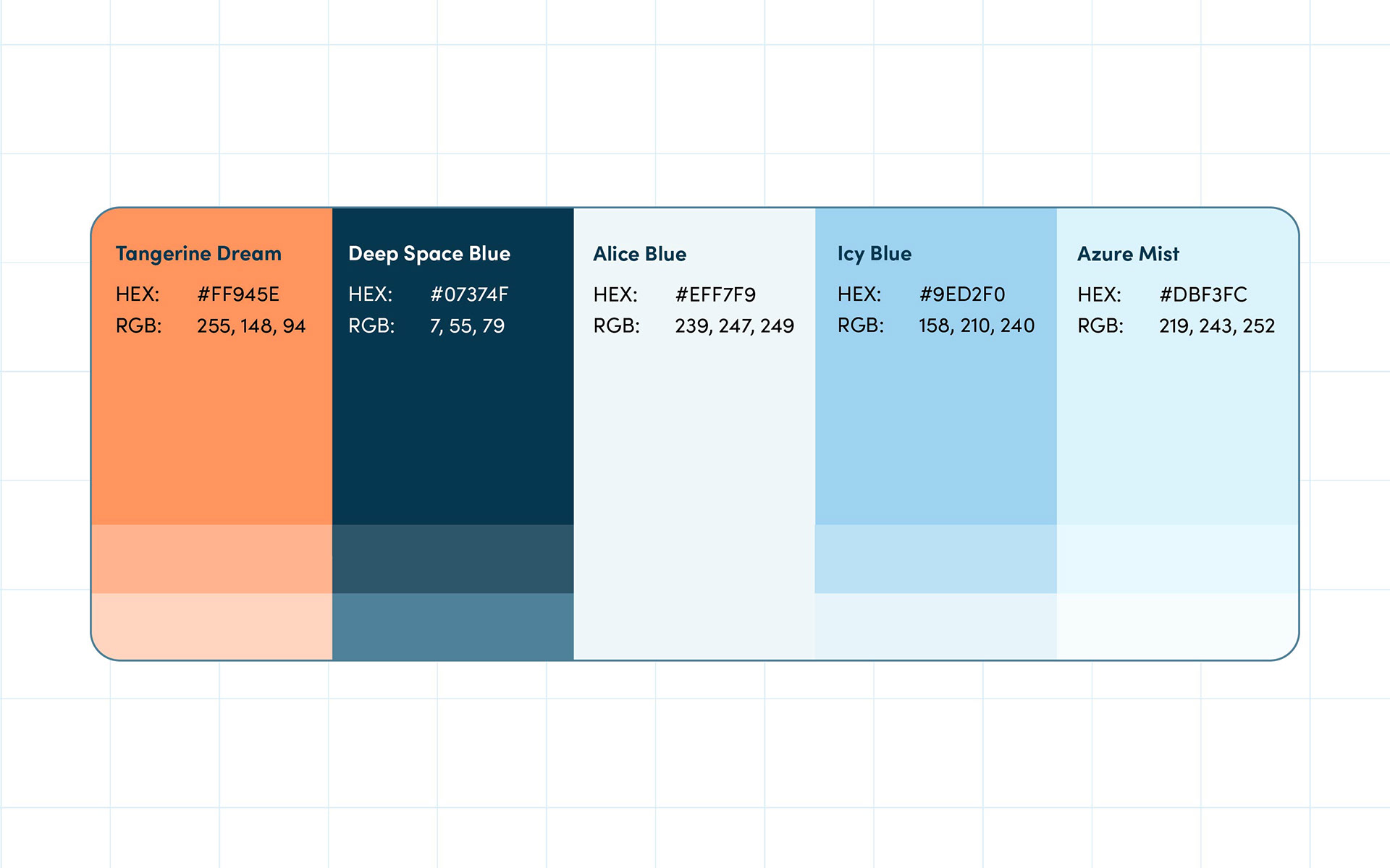
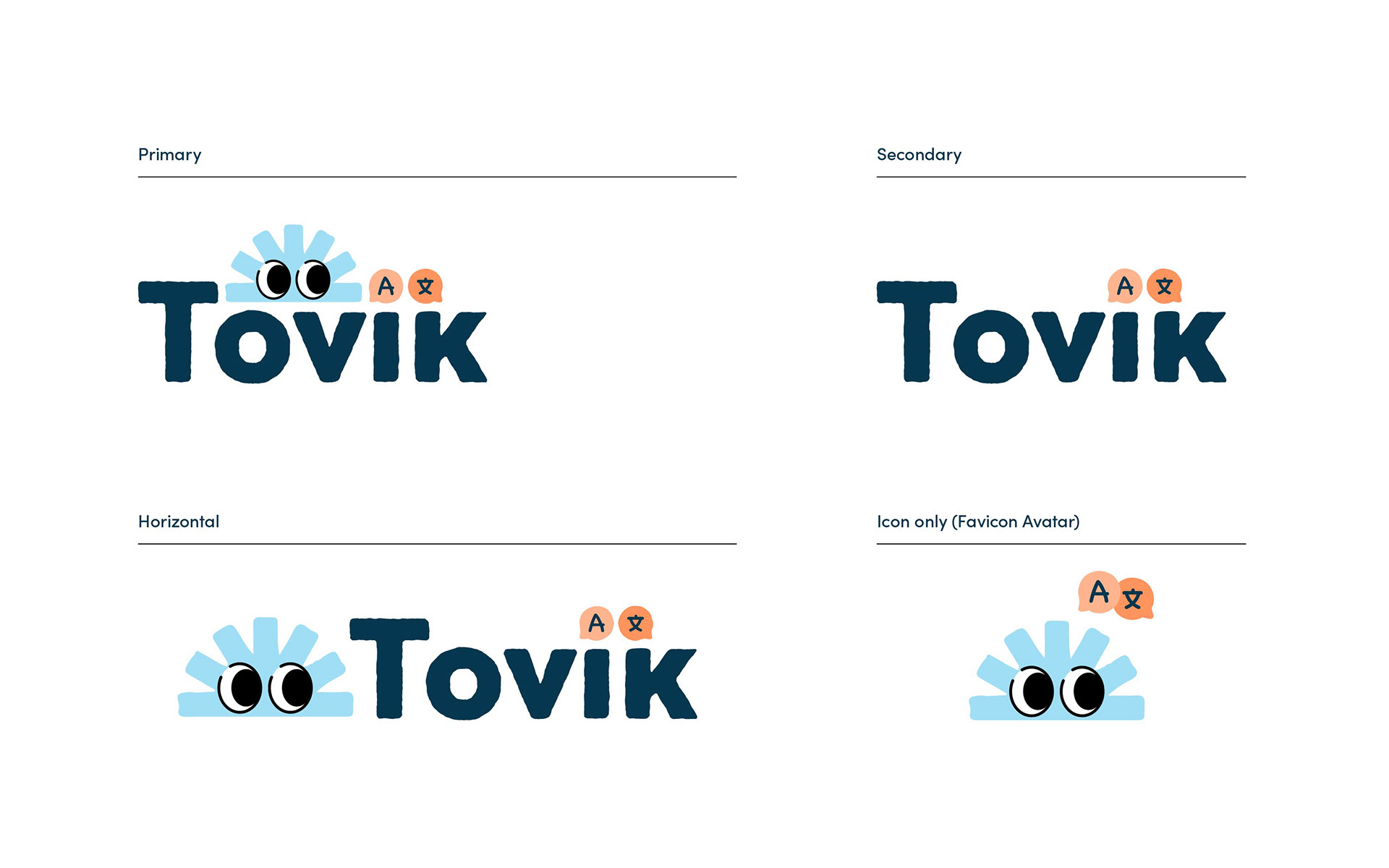
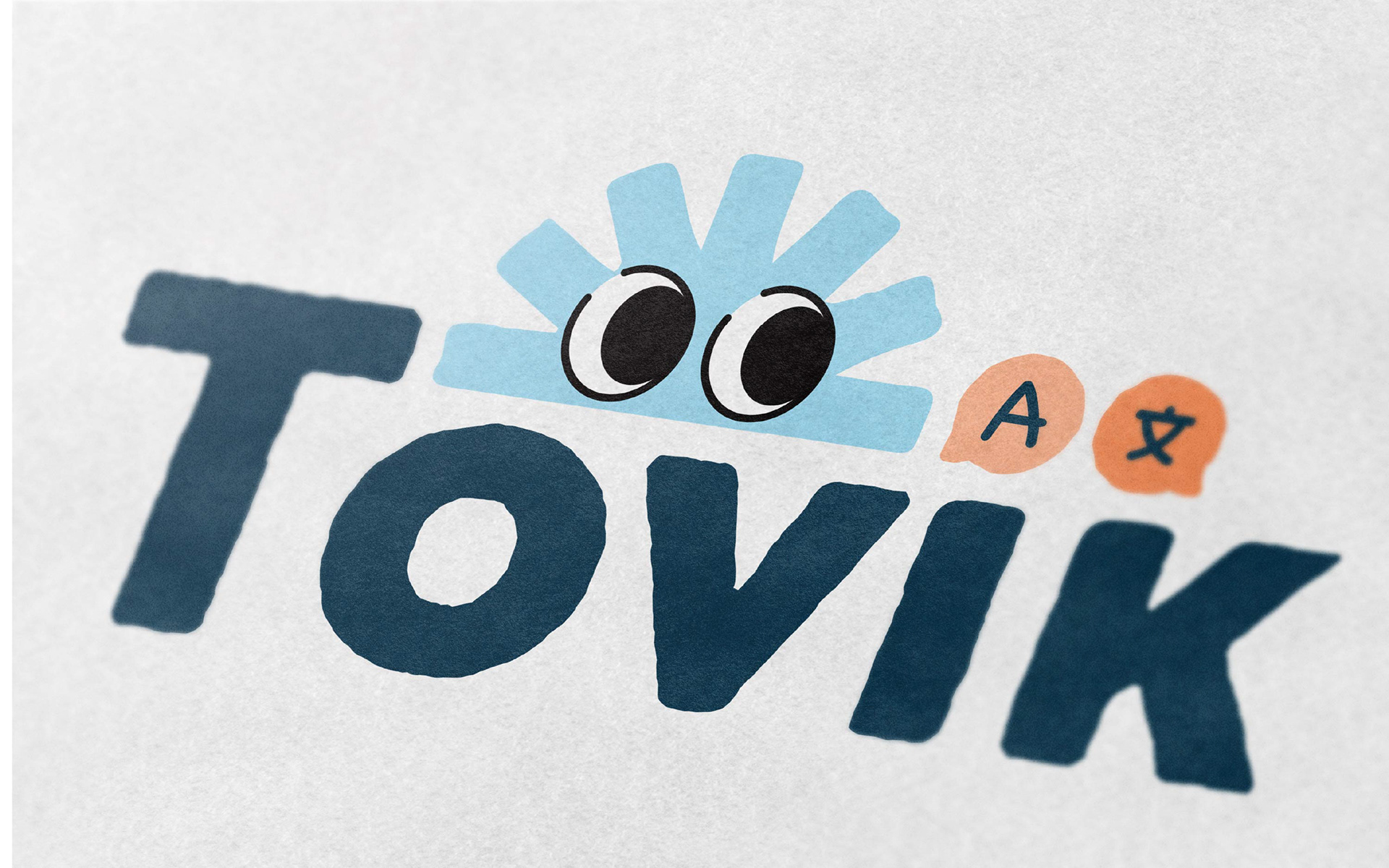
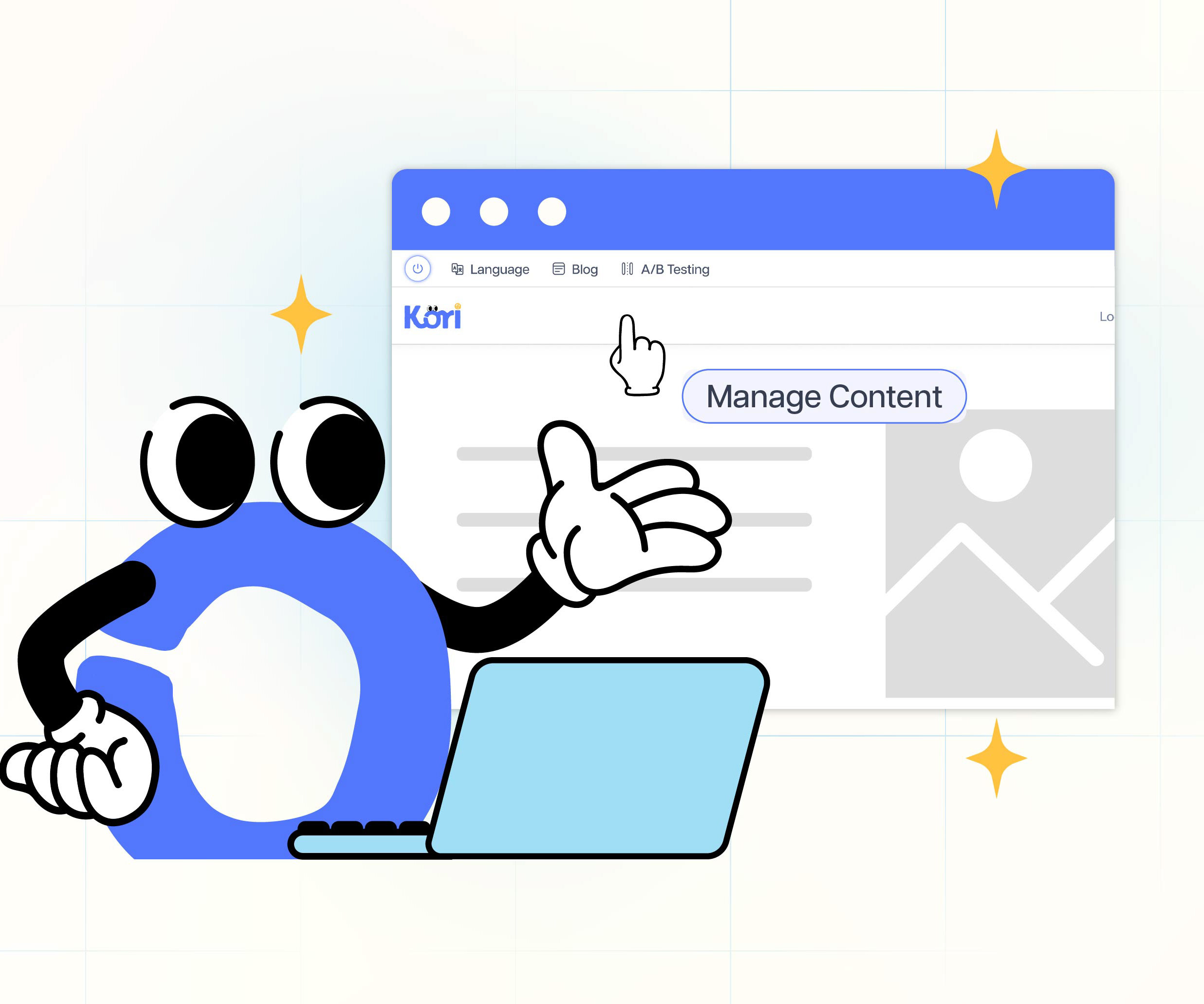
My approach to the Tovik identity was to utilize the translation character from Kori Branding into a multilingual mascot in the role of translator. I focused on creating a brand that feels unique, friendly, helpful, and trustworthy. By exploring several distinct visual concepts, I was able to balance creative freedom with differentiating translator character from Kori Branding and thoughtfully using a complementary color palette between orange and blue, and typography to build a cohesive identity that works across the multilingual online tool platform. With the help of our team, we named this tool "Tovik" as a brand name. Each design decision was made to enhance clarity, reduce corporate style, and balance between security and calmness while maintaining a friendly feel as a tool, and help the brand stand out in a competitive translation online market.
This project was undertaken while I was a Lead Designer at Sparc Cooperative in 2025.
Problems
Multilingual translation plugins or online often lack branding, tone of voice, and their purposes, and often use a traditional corporate-style design or technical style.
Solutions
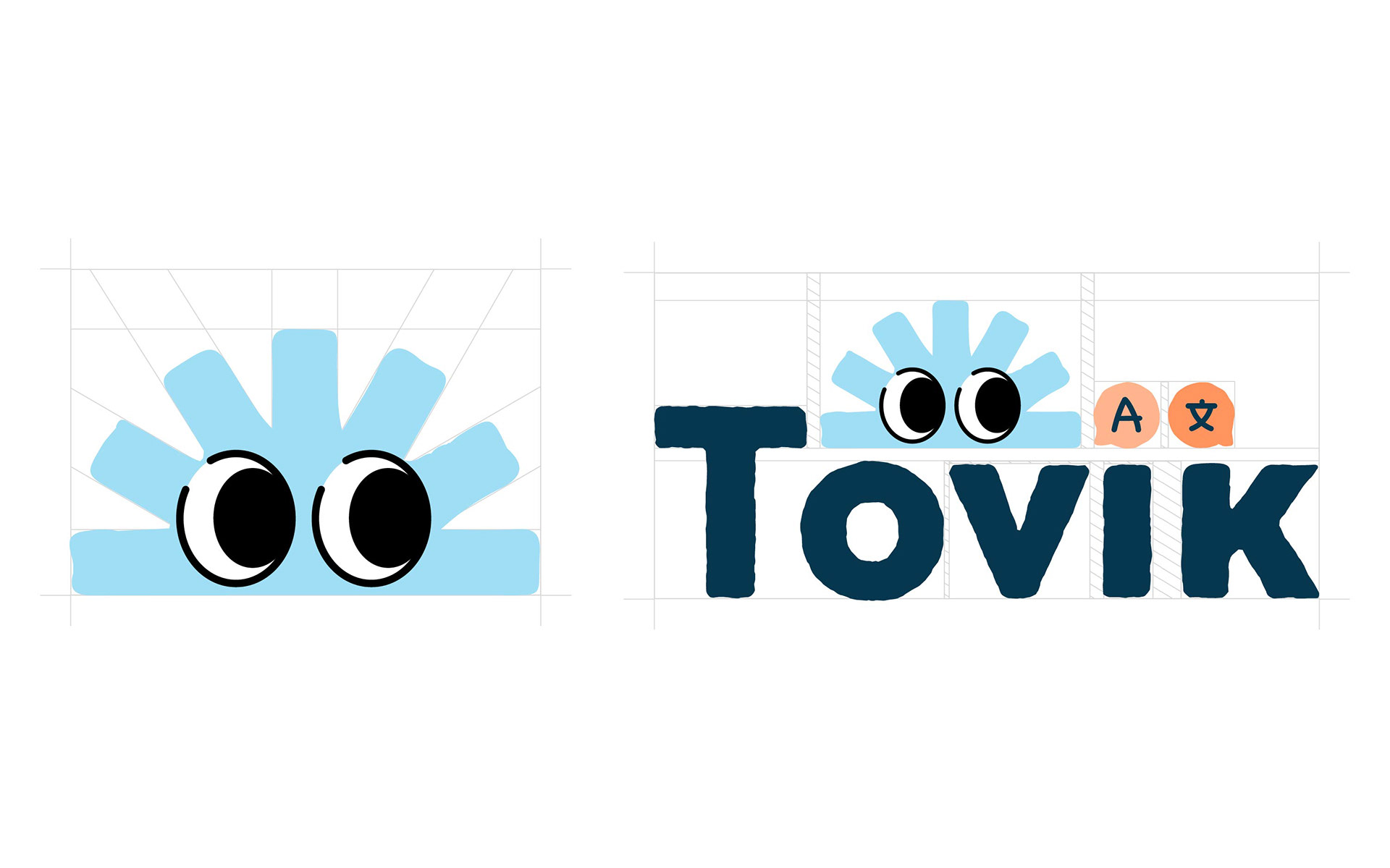
• Develop a brand that is slightly different from Kori's branding, as Tovik is a standalone product.
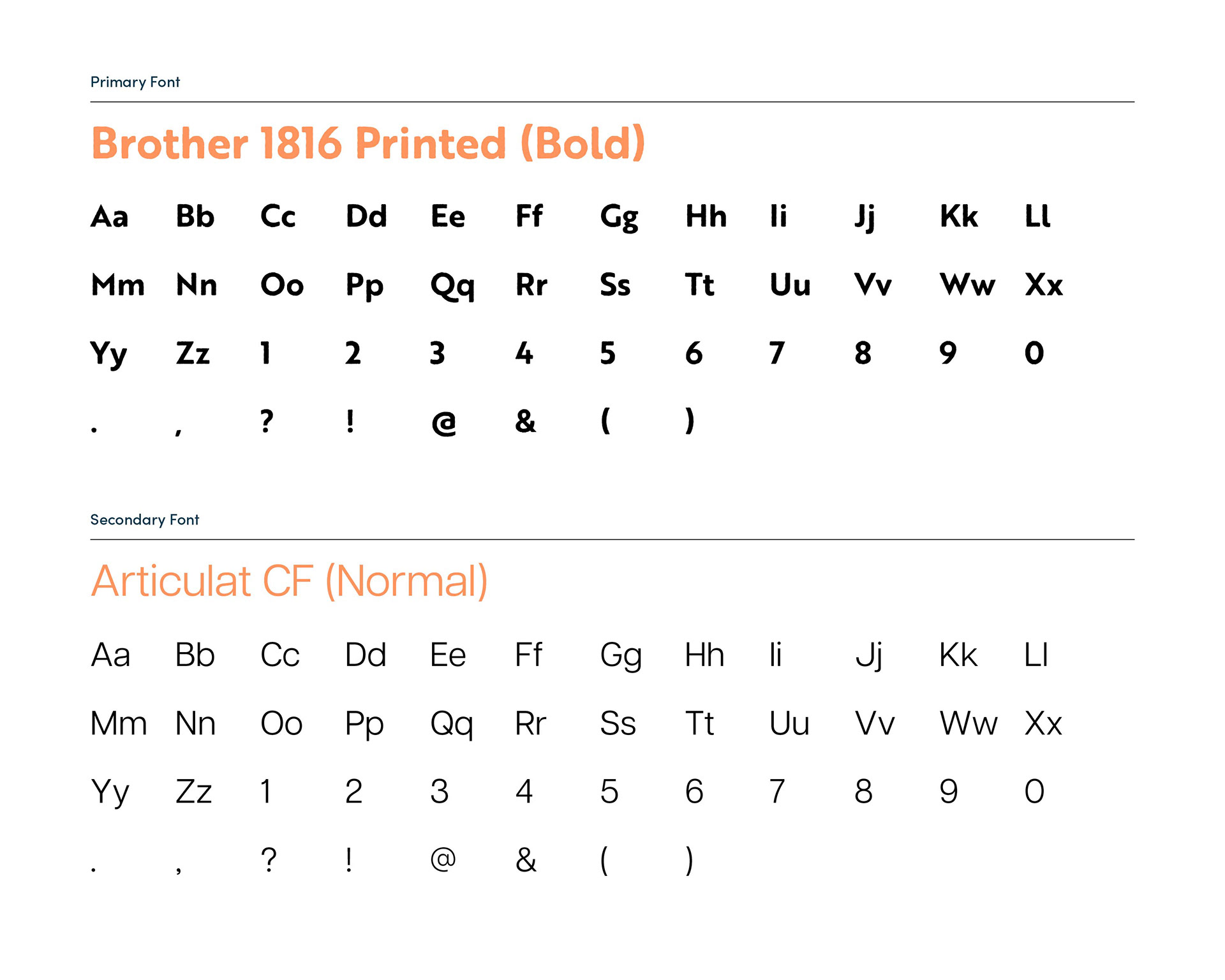
• Craft a strong typographic hierarchy with clean, bold, and sans-serif typefaces, using the same font from Kori Branding
• Adjust the lower ascender of the 'k' to match the height of 'ovi' and to balance the Tovik character with its two chat bubbles.
• Build a rough Beta Program layout design using Figma for the product designer and developer team to implement the design into coding