Project Type:
Sparc Cooperative Product
Scope of Work:
Concept Development
Creation Direction
Branding Identity
Logo Design
UI & UX Design
My Role:
Lead Graphic Designer
Tools:
Adobe Illustrator
Adobe After Effects
Figma
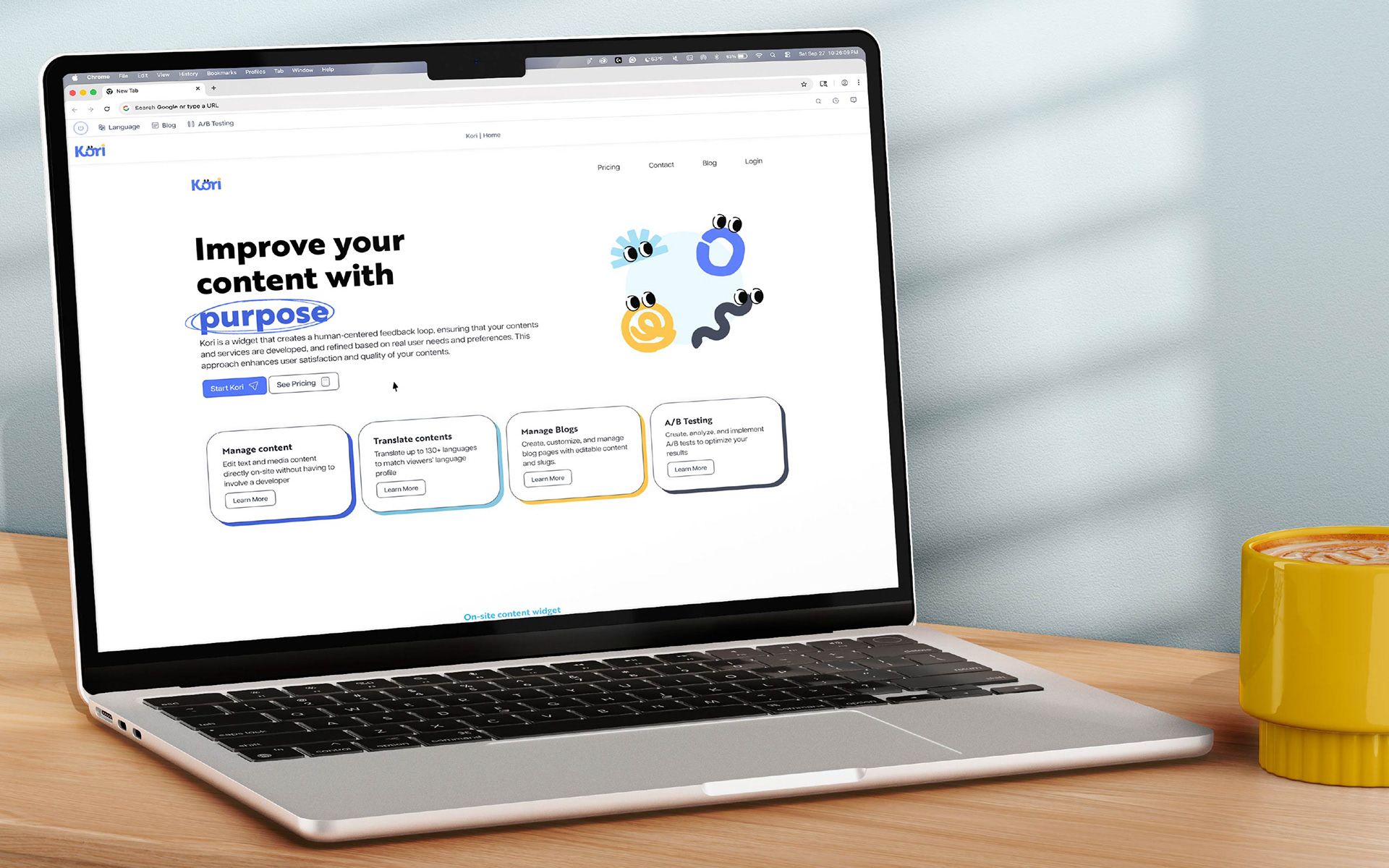
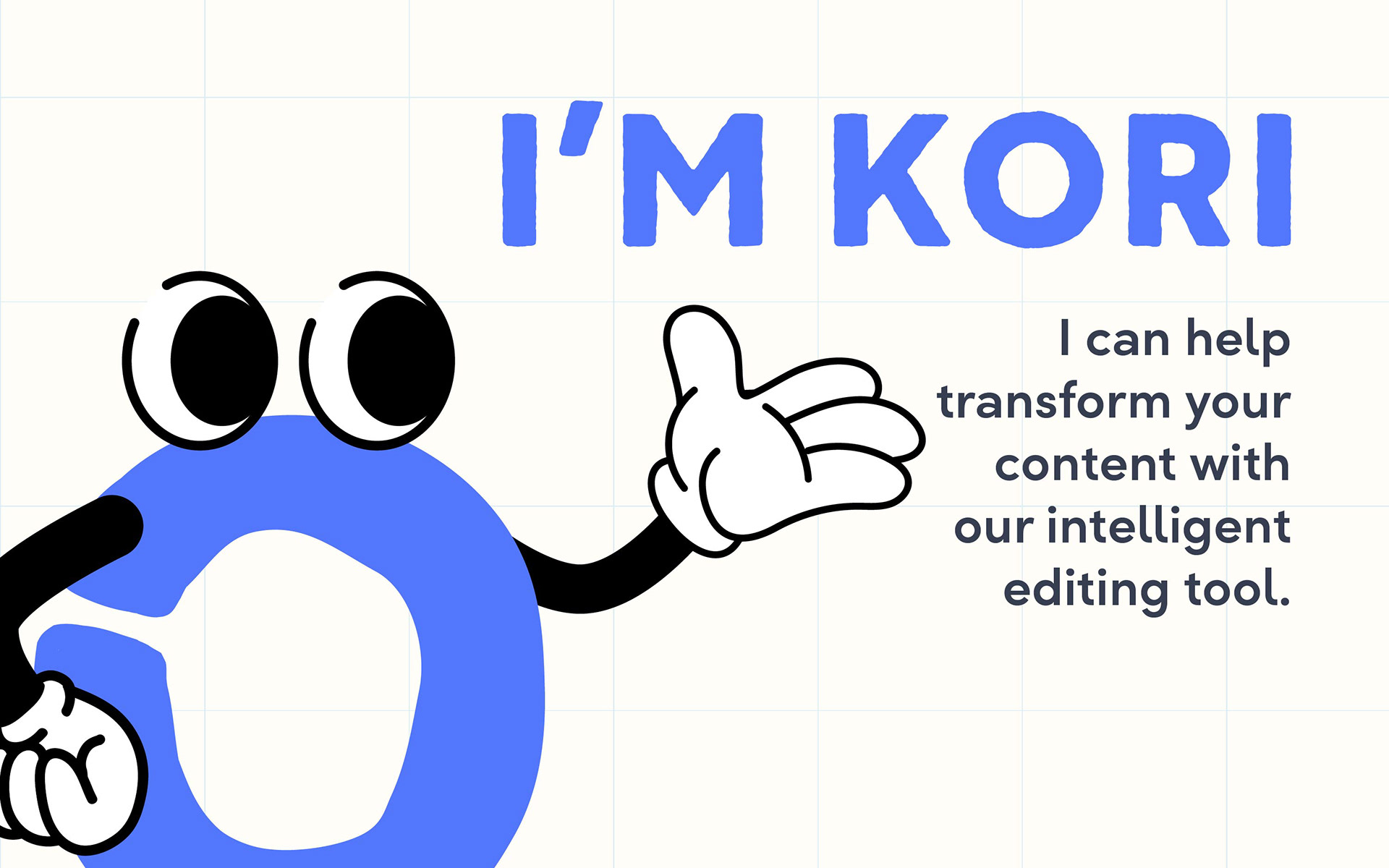
Kori is a content-editing management plugin to help teams create, refine, and publish content with confidence. Our flagship plugin gives marketing managers, content strategists, bloggers, and social media coordinators at companies of all sizes a streamlined workspace to organize, edit, and optimize every piece of content before it goes live.
My Approach
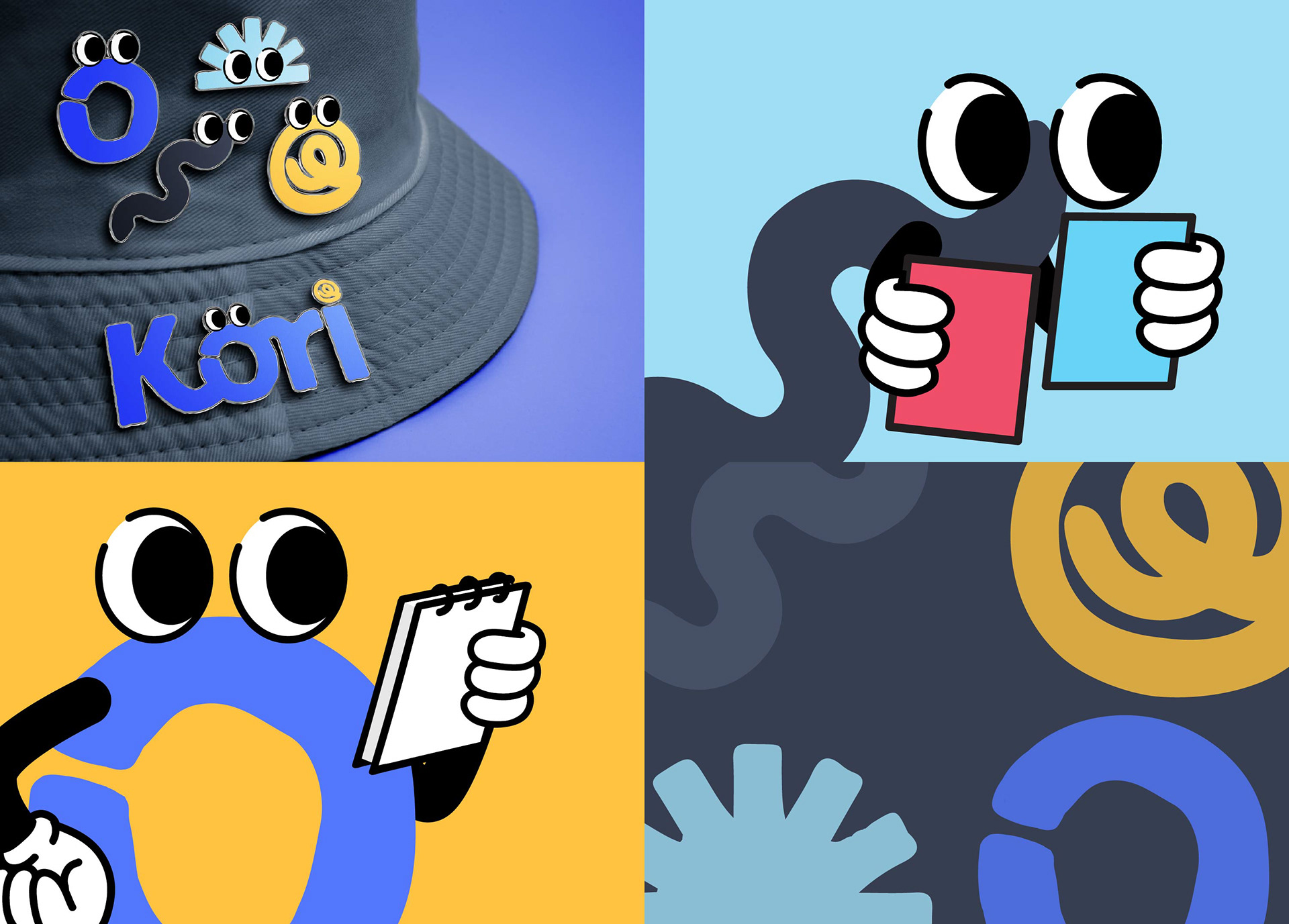
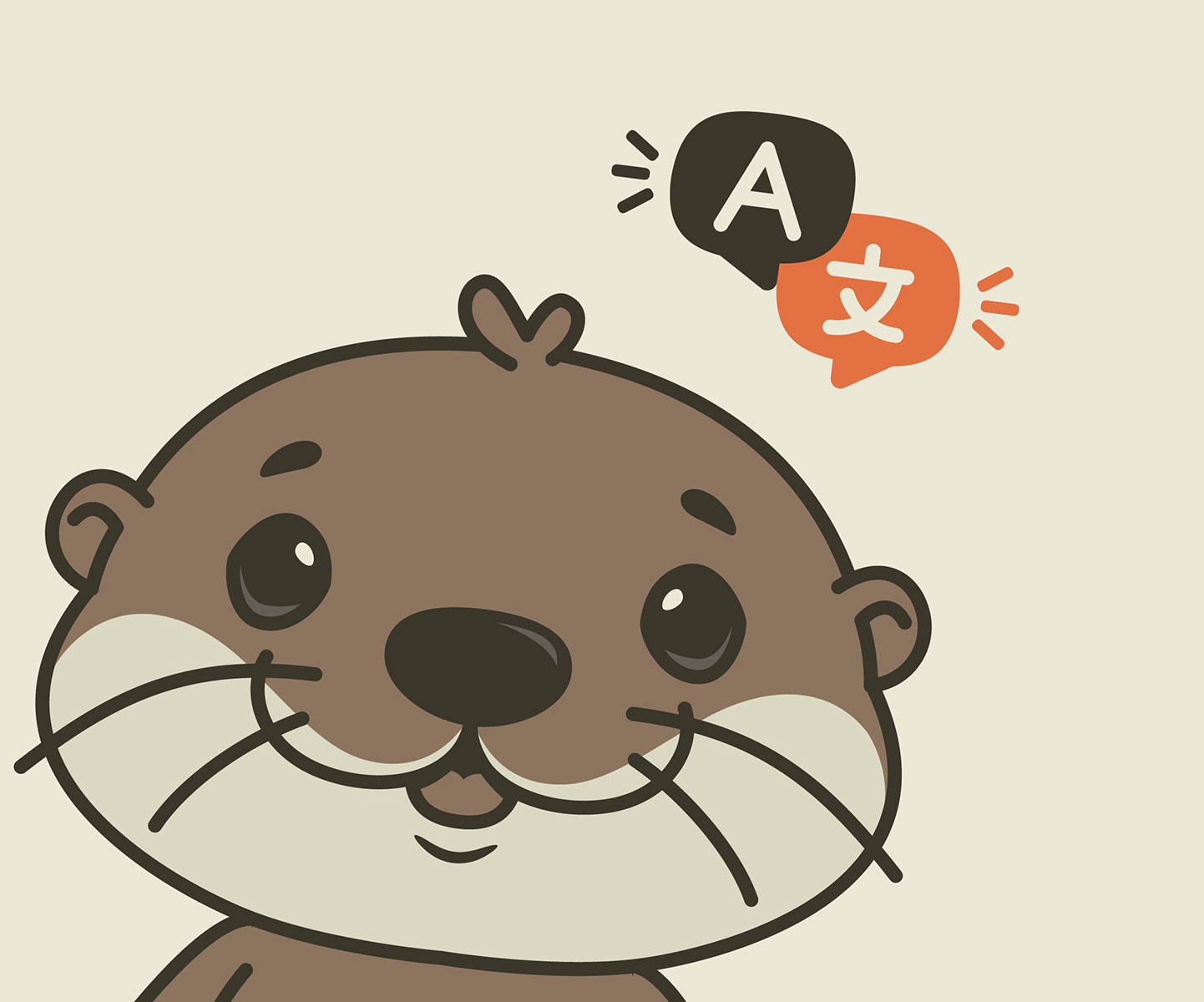
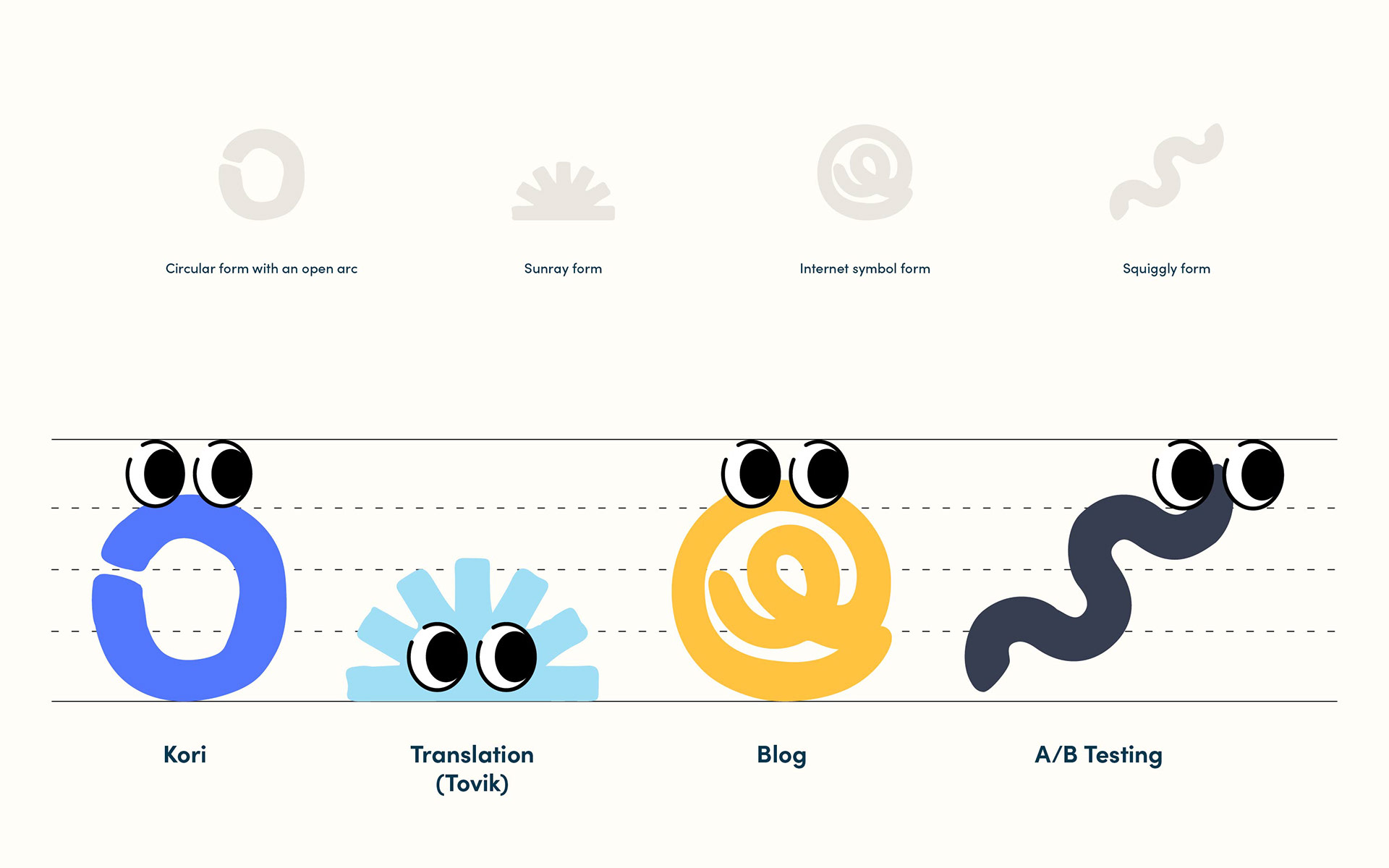
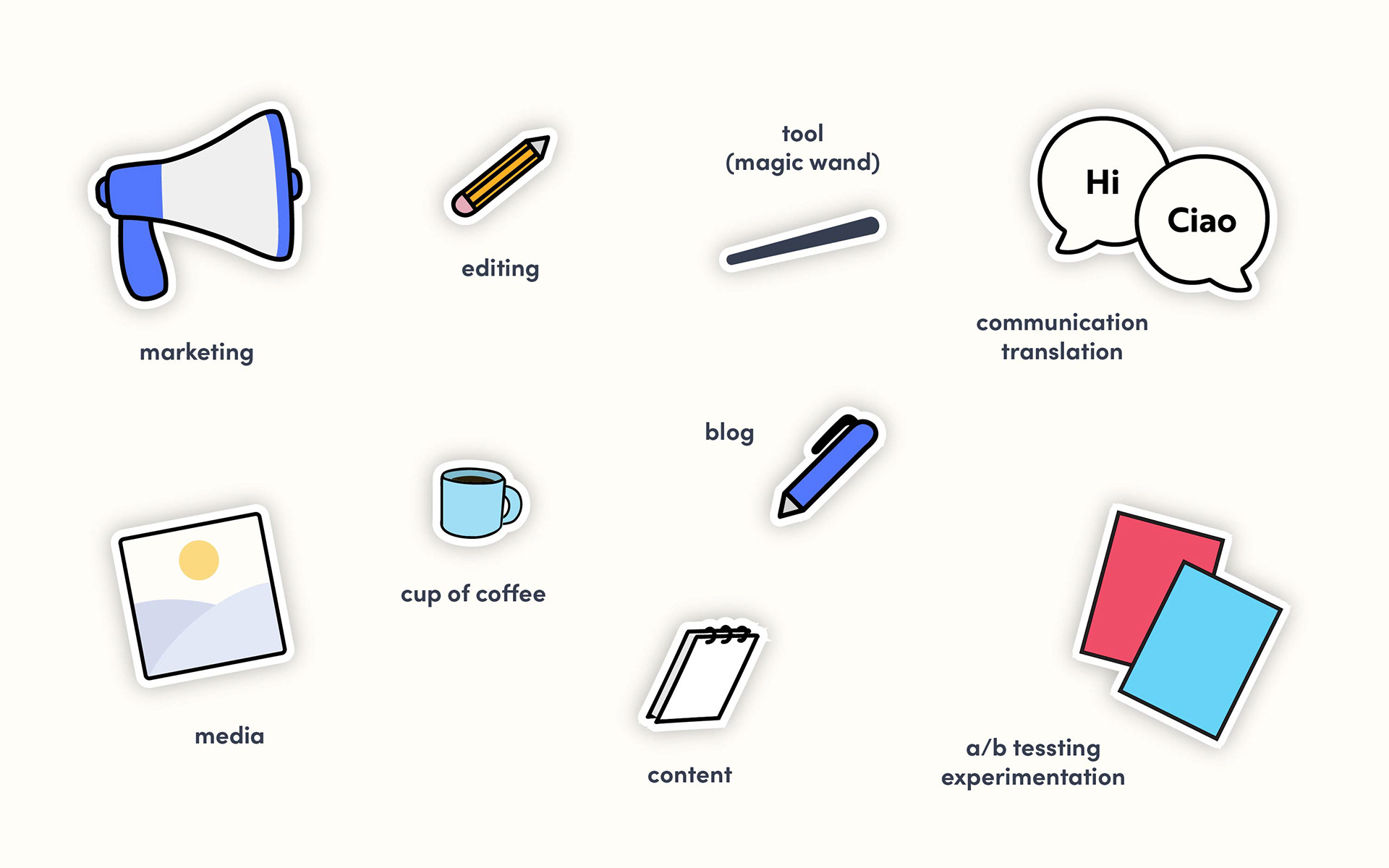
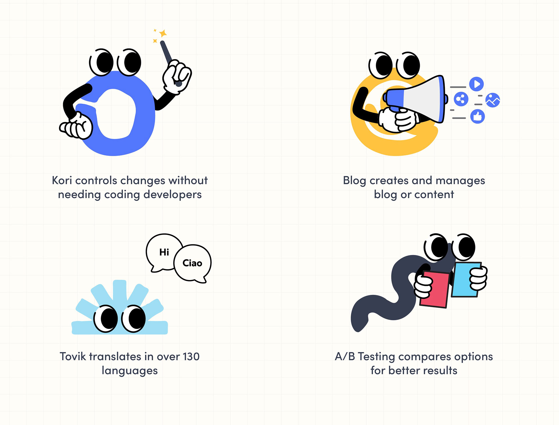
My approach to Kori identity was rooted in friendly teamwork, modern, tech-savvy buddies, and storytelling. I wanted the identity to feel as confident and intentional as a tool that the user could use. Kori's brand voice stays consistent, users' workflow stays organized, and their content is always ready to perform. Kori is a content-editing tool bundle that serves four modes, each managing content in a different way. I came up with four different characters to represent each: Kori - Content Editing, Tovik - Translation, Blog, and A/B Testing.
As part of a creative brief, the name "Kori" is a Korean word meaning “loop” (고리) and refers to a circular shape or object made from rope or metal to connect things. Kori is inspired by the paper-clip character Clippy, who was an Office Assistant in Microsoft Office. We needed a logo and brand that represent what Kori can do through friendly, tech-driven approaches.
This project was undertaken while I was a Lead Designer at Sparc Cooperative. Kori has not been made live due to shifting focus to the other projects.
Problems
In the competitive content management plugin market, marketing teams, managers, content strategists, and other stakeholders often juggle multiple tools with high subscription costs, limited features, and overlapping capabilities. This leads to inefficiencies and misalignment. As part of the Sparc team, we set out to develop our own open-source product: a content-editing management tool. This plugin allows users to gather user data, conduct detailed analysis, and create better, more relevant content.
Solutions
• Develop Kori branding and incorporate three additional characters: Translation, A/B testing, and Blog.
• Serene and Calm Color Palette — to evoke clarity, calmness, and creativity tones that align with playful shapes
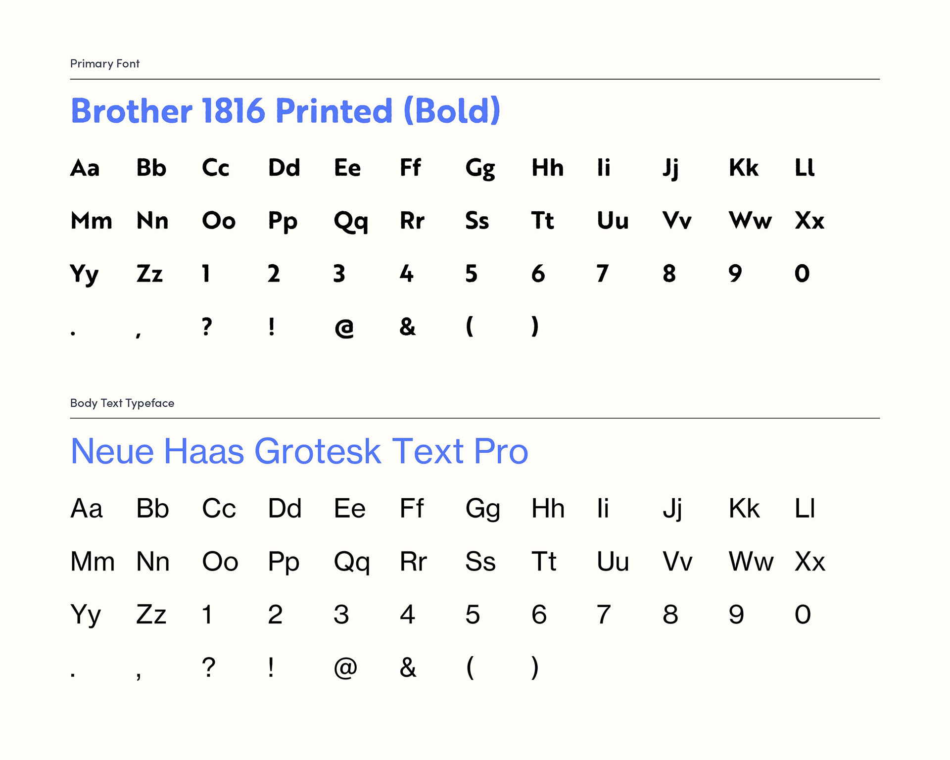
• Sans-Serif and Display Fonts — Brother 1816 Printed Bold usage as logo and headings, and Neue Haas Grotesk Text Pro usage for body texts for readability and clean typeface
• Develop a logo that stands out from our tech/software competitors, which are vibrant, unique, friendly, and less corporate in nature. It should reflect a modern, friendly, and tech-savvy aesthetic while maintaining a clean and minimalist design.
• Utilize various shapes to convey cohesive team spirit among Kori.
• Build an individual animation of a Kori team to represent what each does.
• Build a beta program layout design using Figma
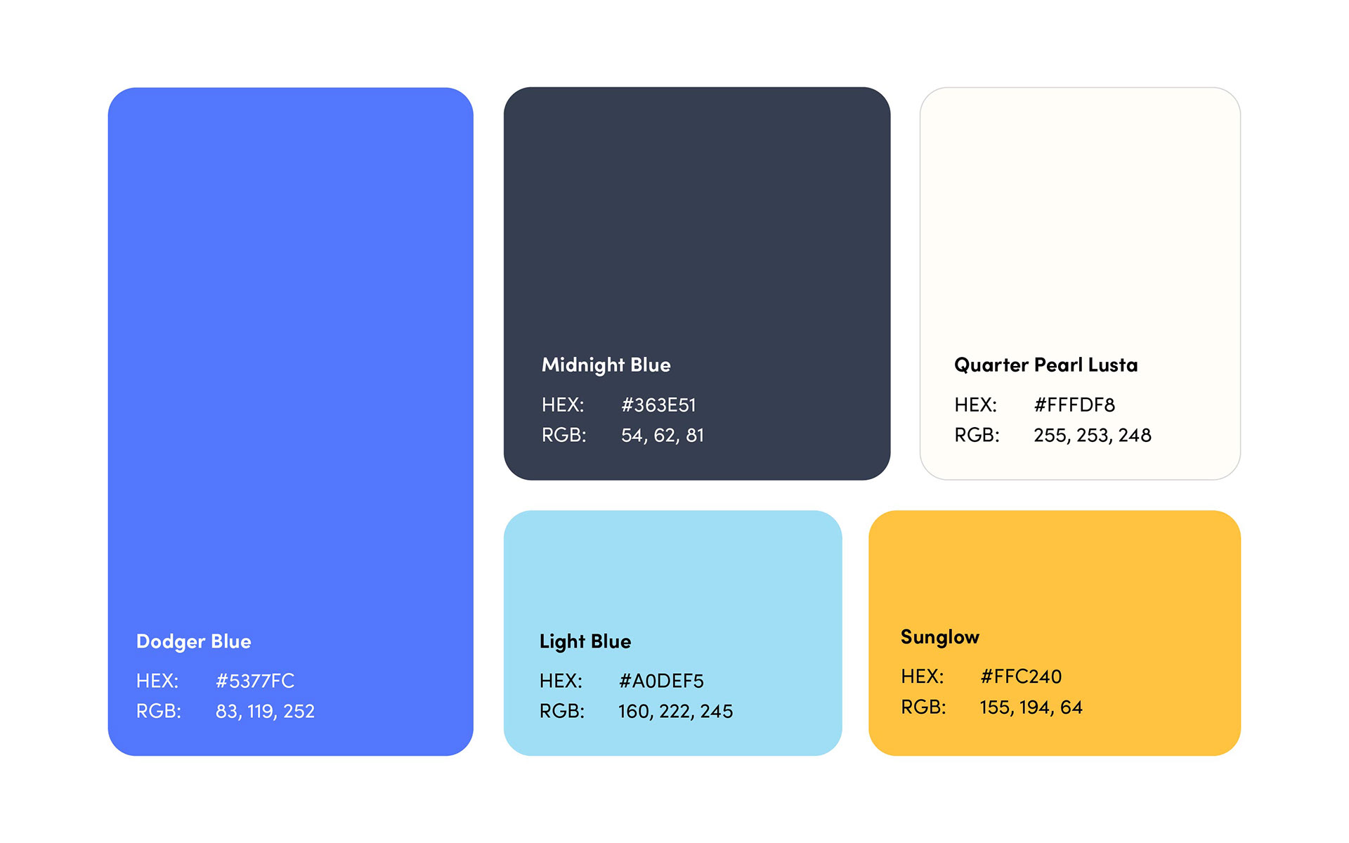
Color Palette
Dodger Blue tone is associated with trustworthiness, clarity, calmness, and dependability, which are ideal for a content creation or editing tool.
Midnight Blue conveys seriousness, trust, and analysis, balancing the playful shape with a tone of reliability.
Sunglow tone is associated with energy, positivity, and creativity. It conveys warmth and friendliness, which are ideal for a blog role, as blogs are about sharing ideas and connecting with an audience.
Quarter Pearl Lusta (white) tone is clean and clear.
Light blue is associated with a sense of whimsy, gentleness, and organic friendliness.
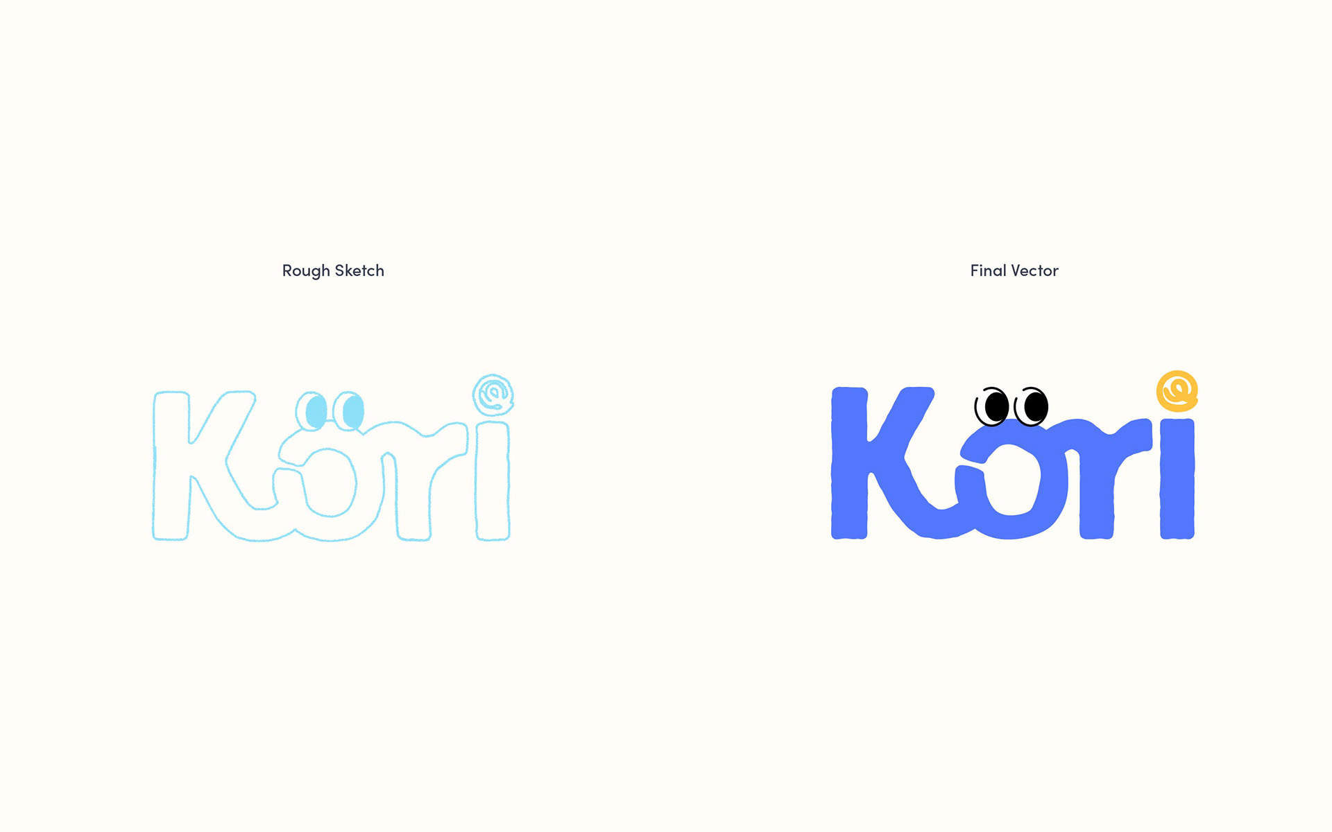
Kori Logo - "O"
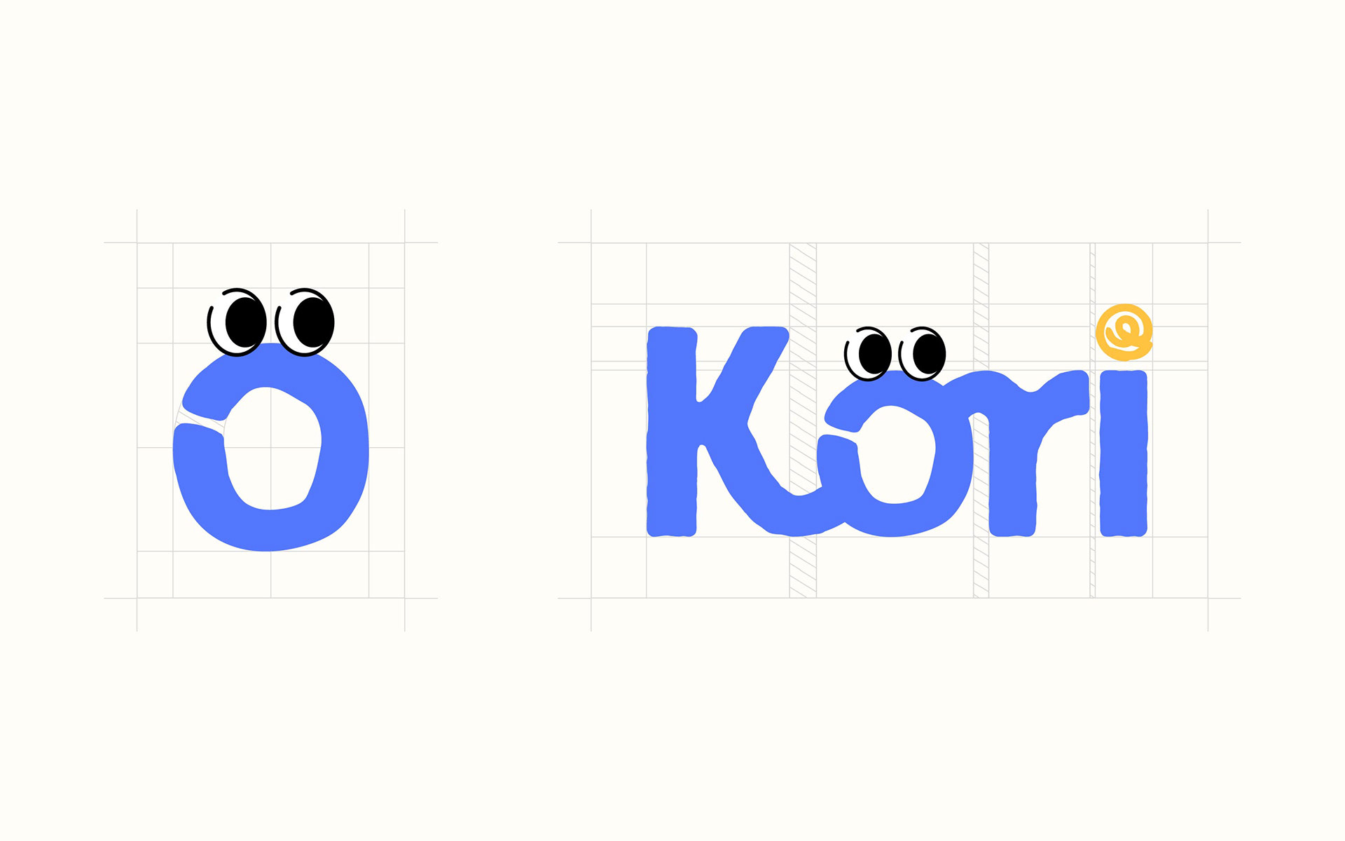
I came up with an 'O' letter as a loop or circular shape for Kori as a character. It features the character from the standalone icon — the 'O' with googly eyes — to make the brand feel lively, engaging, and slightly whimsical. The eyes give the logo personality and emotional connection, transforming it into a character rather than just a wordmark and making it less corporate. The "O" resembles a mouth-like gap, serving as a metaphor for a content editor, communication tool, or voice-driven platform.
The word "Kori" is set in a bold sans-serif font, Brother 1816 Printed typeface, which translates to a bold, bubbly, and fresh look. The typeface is edgy in a soft, playful, and expressive way, aligning elements like a decorative @ symbol on the "dot" of "i."
Kori Logo - "i"
The text color in the wordmark is blue because it symbolizes clarity, calmness, and dependability, which are ideal for a content creation or editing tool. Kori uses the color yellow at the symbol or "dot" on the "i" to inject energy, creativity, and enthusiasm as a playful accent. Yellow captures attention and contrasts nicely with blue, indicating interactivity. The swirl in the "@" on the "i" is used to add a unique, creative visual element while maintaining on-brand consistency with a playful, friendly tone.

Kori — The "O" resembles a mouth-like gap, serving as a metaphor for a content editor, communication tool, or voice-driven platform.
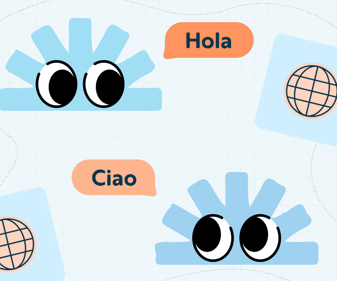
Tovik — The sunray form, or a semicircle base with radiating bars extending outward like rays, almost resembling a simplified rising sun. It conveys a universality that represents a burst or sunray, not limited to any specific culture or language, but spreading lines represent communication branching outward, symbolizing how one message can expand into many languages.
Blog — The internet symbol form resembles an “@” symbol, which is universally recognized as part of the internet, communication, and especially sharing ideas, as well as blogging and writing online to an audience.
A/B Testing — The squiggly line represents experimentation and variation—things aren’t straight or predictable, just like in A/B testing, where different paths are tested. It also shows that A/B testing explores different paths, carefully observes outcomes, and helps make smart, unbiased decisions.
Sparc Team
UX/Implementation Designer
UI Designer
Product Engineer
Product Architecture
Data Architecture
Product Marketer
Copywriter
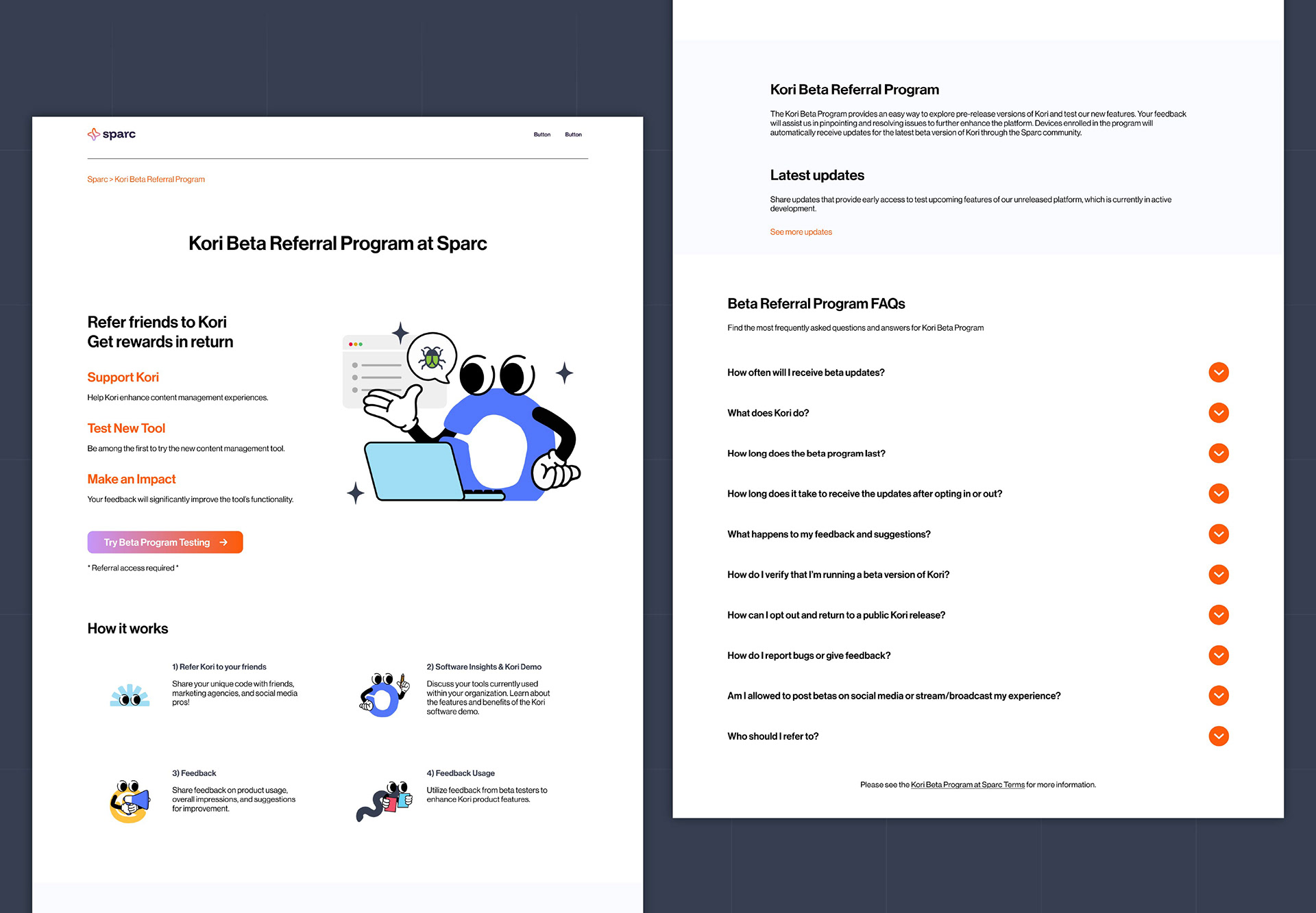
Kori Beta Referral Program
The Kori Beta Referral Program was an invitation-only event offered to beta users on our website, Sparc Cooperative.
Our marketing team researched a beta referral program to understand better how we can improve our beta testing by inviting our beta users. Using this method also helped us to identify the right target audience and demographic. We wanted to connect with a specific group and invite them to become beta users by trying the Kori plugin on their browser. This will help us gather valuable insights and feedback from their experiences, enabling us to improve the user experience and user interface of the Kori plugin.
I developed a beta referral program design utilizing Figma. As this project is hosted on the Sparc Cooperative website, I ensured that the design adheres to the Sparc Cooperative branding guidelines in order to maintain consistency with the organization's Brand Standards.